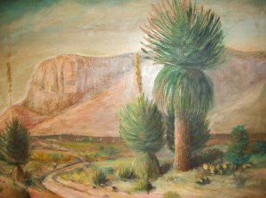
The secondary color scheme using green, orange, and violet are especially good in landscape paintings. It is very good at creating harmony which landscapes paintings need to give you that inviting feeling of being able to walk right into them.

At the left is a 24X30 picture of Signal Peak, New Mexico, that my father painted in 1978. Although he didn’t always paint with three colors based on the triadic color scale, it is obvious he did so in this painting. It exhibits the harmony so valuable to make the colors work together.
This painting also shows the elements of color and how they work together–light against dark (value), warm against cool (temperature), bright against dull (intensity). In other words, how contrast builds color harmony and creates interest and exhibits an energy in your landscape paintings.
