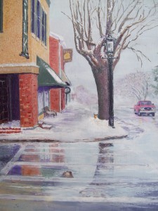
Directing your viewers to your center of interest–your focal point–requires an understanding to exactly what makes your viewers eyes move around the painting or drawing and always wind up at the (shall I say) bullseye.

This can be done in many ways. For example, in the picture I painted, The Red Truck, I used directional use such as the small limb on the upper left at an angle askew at approximately 45 degrees and leading the eye to the lower right branch continuing downward at the same angle but aiming at the red truck. Also the natural curve of the turn of the road with the icy sheen also directs the eye up the street to the truck. Even the angle of the canopy over the window of the building aims at the truck.
It also can be done using colors and values. In this instance, the greater chroma is in the buildings because they are nearest to the viewer and obviously were not as affected by the weather. However the use of red for the truck will naturally take a viewers eyes off the higher chroma left of the painting and to the only chroma to the right. The actual truck was gray and hardly showed in the cold winter day.
The article I wrote on my blog How to Draw Attention to Your Focal Point on 12/20/2011 goes into much greater detail on how master artist Grant Wood captivated the viewer and made it impossible for them to take their focus away from the focal point. The painting I discussed was American Gothic. I discussed color, value, and directional lines. Besides master artist, Jan Van Eyck, I personally feel Grant’s work was one of the best for capturing the viewer’s attention. It’s a great read, if you haven’t seen it, go to: http://tinyurl.com/bpw6xt7 or simply click on the picture.
