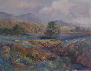
When it comes to composition, the main “rule” (if you want to call it that) is to attract the viewer’s attention. You want to direct them to the important area of the painting and hold their focus as long as possible. As far as is concerned, any method used to accomplish this objective is legitimate.
There are three qualities in a landscape painting that are important and should be considered. They are: harmony, simplicity and subtlety.
Tip: When considering harmony, an artist may wish to consider a single source of light on the subject, or any other other device; such as, an overall tonality; color related areas; precise control of edges; integrated linear pattern; or a combination of each, allowing one to be more dominant than the others.

Tip: Simplicity is always a good rule to consider when painting a landscape, no matter the size or the complexity of the subject. The word, simplicity, by its very nature seems simple…right? Wrong! Sometimes it takes more work achieving simplicity (deciding what a painting needs and does not need) than painting everything your eyes are seeing. Remember, there is no limit to the possible arrangements of compositional elements within a picture. An artist must decide the useful elements that are needed to make the painting the most alluring.
Tip:When considering subtlety, if the artist paints a landscape where the composition is obvious, it tends to defeat its purpose. A composition should merely be an aspect of something abstract of a total effort. Each element needs to remain subordinate to the representation of the main subject.

Be sure to sign up for Art Center Information’s Newsletter (upper right of page). You will automatically be entered to win a beautiful art coffee table book. Also, check out the gallery of artwork listed at top.
Do you have a copyright protection on your artwork? Check out the notice on the right side of page>>>
