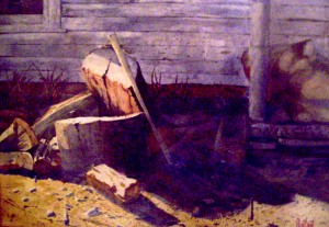
 Here is a good question for artists: why is it so hard to be simple, and not complicated? I’ve found the more I’ve aged, the more complicated I’ve become. It’s just the way it is. Is it because I desire to be an artist that now wishes to make a statement? I have no idea.
The picture to the left, painted in the 1980s (yeah, that’s in the last century), would be considered (at least by me) simple. In it’s simplicity, it’s beautiful. So why am I so complicated now? At this point in my career, I should be slapping paint on canvas, not having a care in the world, and just having fun. But, instead, I’m concentrating on much more complicated compositions. Somehow, I thought it would work the other way, but it doesn’t.
Lately, I’ve had this muse. It’s too complicated to explain on this blog post. I’ll make it the entire next blog post, but it’s really bugging me. Forgive me for using old last century language, but it really is BUGGING ME! I can’t get it out of my mind. (The next Blog Post — don’t miss it.)

Take for example of the graphite drawing of Father Time at the right.. It is simple and in its own way, interesting. Sadly, it is not one of my original compositions, even if every stroke of the graphite pencil is my own. The original composition is from the artist, Andrew Loomis.
In my early days, I copied a lot of artists. This is the only way I could learn to create as a self taught artist. I loved the simplistic style, the stroke of every pencil point upon the paper. To me, it was beautiful. However, I constantly thought about making a picture of my own composition of Father Time. So, could I do something simple?…evidently, not.

In a much more complicated manner, my most recent drawing of “Father Time” is on the left. I call this painting The Grinding Gears of Time featuring clock gears in the background. Which picture is the best? For me, the one on the left, because it’s my own composition. But in all fairness, the copy of the Loomis is much less complicated, and is beautiful.
Please check out the galleries above, the Burton Gallery, which shows my artwork, my grand daughter’s artwork, and one of my father’s famous paintings. Also, visit Lynn Burton’s Gallery (my brother). Check out the Great Opportunity sight for good sights suggested for artists. I could use some “likes” on my Facebook page at the right.
Be sure to enter the newsletter, and take a chance on winning a beautiful free art book, Splash 14.
