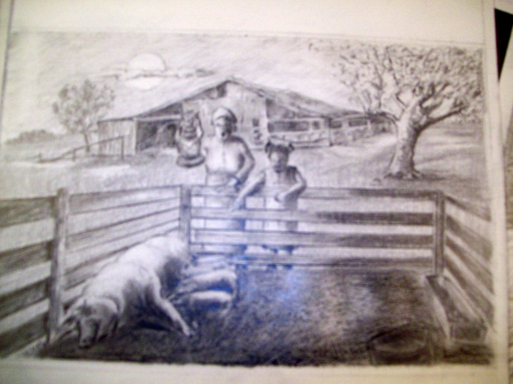
Sometimes an artist decides to step out of their comfort zone to a much more uncomfortable zone. In my case, from fine art drawing and painting to illustration work.
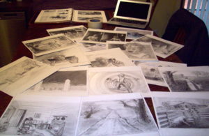
I am in the process of doing graphite drawing works for a narrated short slide graphic story that is to be placed on YouTube sometime in the future. That is, if I ever get my part finished. Also, if the producer gets a narrator, actors, music and sound effects that can fit into the drawn frames as they slip and slide across the screen. To date, I have made a great many drawings with many more to do.
Without spilling the beans and telling the story, all I can say is that it is a “gripper”. I was concerned at first, because I felt it wasn’t PC correct until I realized it was total fiction set in the deep south in1897 when there was no PC correctness. Most of all, there is the possibility that a Zombie is involved. Let’s face it, do we have to be PC correct with a Zombie? That’s all I’m going to mention about the story. However, there is more to discuss about illustration work.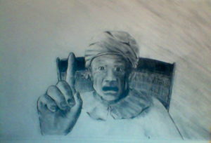
I have learned the hard way that pictures seldom “just” happen. A good picture encompasses related elements supporting and strengthening each other that determines the form and success of the finished work. No matter how well you draw or paint, a picture will not be complete until all its parts have been put harmoniously together.
It is important for an artist to clearly understand what they wish to communicate, and then give pictorial form to the idea. When they do, they must arrange the shapes into a logical order which helps get the original idea clearly across to the viewer.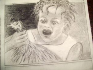
Remember that the first image that comes to mind is only a possibility. An artist often thinks on paper. I know I certainly do. It is the only way I’ve ever found to come up with a picture that works. The picture on the right (>>) took at least fourteen small sketches before I finally settled on this one. Of course, when illustrating, the picture must relate to the story.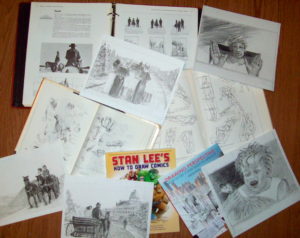
To think, draw, and arrange the objects you need for your composition is time consuming; but it is also one of the most interesting and important (as well as fun) steps to a completed illustration.
It doesn’t take long to understand that when placing objects in a picture, one needs to reduce them to their most simplistic shapes. For example, two individuals are facing each other in the composition. The closest one has his back to the viewer, the other facing him is farther away? Sometimes the person closest to the viewer is much larger than the one farther away. So, a good understanding of perspective is critical.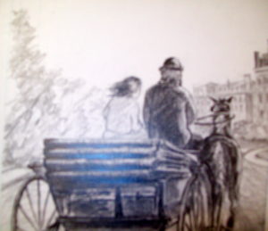
Sometimes I will draw separately on different paper all objects to be in a picture. I will blow them up or down on my printer, cut them out, and experiment with them together onto a separate paper while using a perspective grid to make sure the size relationship is correct.
My favorite book on perspective is Matthew Brehm’s book: DRAWING PERSPECTIVE HOW TO SEE IT AND HOW TO APPLY IT.
After thinking, drawing, arranging and checking perspective, you must consider the very important BIG THREE…DEPTH, LINE,VALUE. This will be discussed in another blog.
