 Why do some paintings and drawings seem to work while others do not? It depends on how much an artist puts into the planning stages. When it comes to composition, some artists seem to do things instinctively, almost as if it comes natural. These are usually artists that have spent a good deal of time with palette and brush in hand. When painting or drawing, they naturally think of the main elements of composition: AREA; DEPTH; LINE; and VALUE.
AREA: This is the flat surface within the four borders which you draw and paint. You need to concern yourself with the objects that you place in the picture, and how they relate to each other. How large are they?

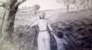
DEPTH: A large house (southern mansion) is above and to the left of the woman’s head. A tree is in the lawn of the mansion drawn much smaller than the trees on the right side of the picture. However, when looking at it, it seems to be as tall as the trees on the right. This feels natural to a viewer, because the different sizes represent distance. When representing depth, objects are drawn or painted in a way they seem to exist in space, appearing close or far away to the viewer. The partial large trunk of the tree to the right, and the expanse and different levels of the ground also depict depth.
LINE: By arranging the objects in your composition so their shapes or main lines lead a viewer’s eye unconsciously to the center of interest.
VALUE: Simply put, value is the lightness or darkness of either a particular area or shape within the picture or of the whole picture.
There is much to consider when working with value. I only recall something I read once by N.C. Wyeth, “Let your darks be dark, and your lights light.”
My brother, artist, Lynn Burton (gallery above) always said to put drawing or painting in a dark room with very little light, and if you can make out the objects in the picture, then the value is correct.
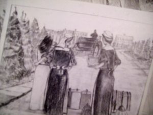
Whether it works or not, the darkest area of the illustration above is the nurse’s dress (the woman in the middle). It is next to the white dress on the woman on the left. A viewer’s eye should go directly to these two women. The nurse uniforms would not work today, but this is the way they were in 1897 in South Carolina. This is illustration work for a graphic novel. The women are staring at the father of the woman in white. He’d just dropped the young woman off at the Howloon Asylem for the mentally ill. She is in agony, and the nurse next to her is coddling her. Everything in this picture is depth, line, and value.
Be sure to join our newsletter (above right). Also, be so kind as to “like” my Facebook page (check it out to the right). Also visit the galleries above.
