Tip: Building an Art Career

Richard D. Burton
Richard D. Burton

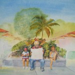
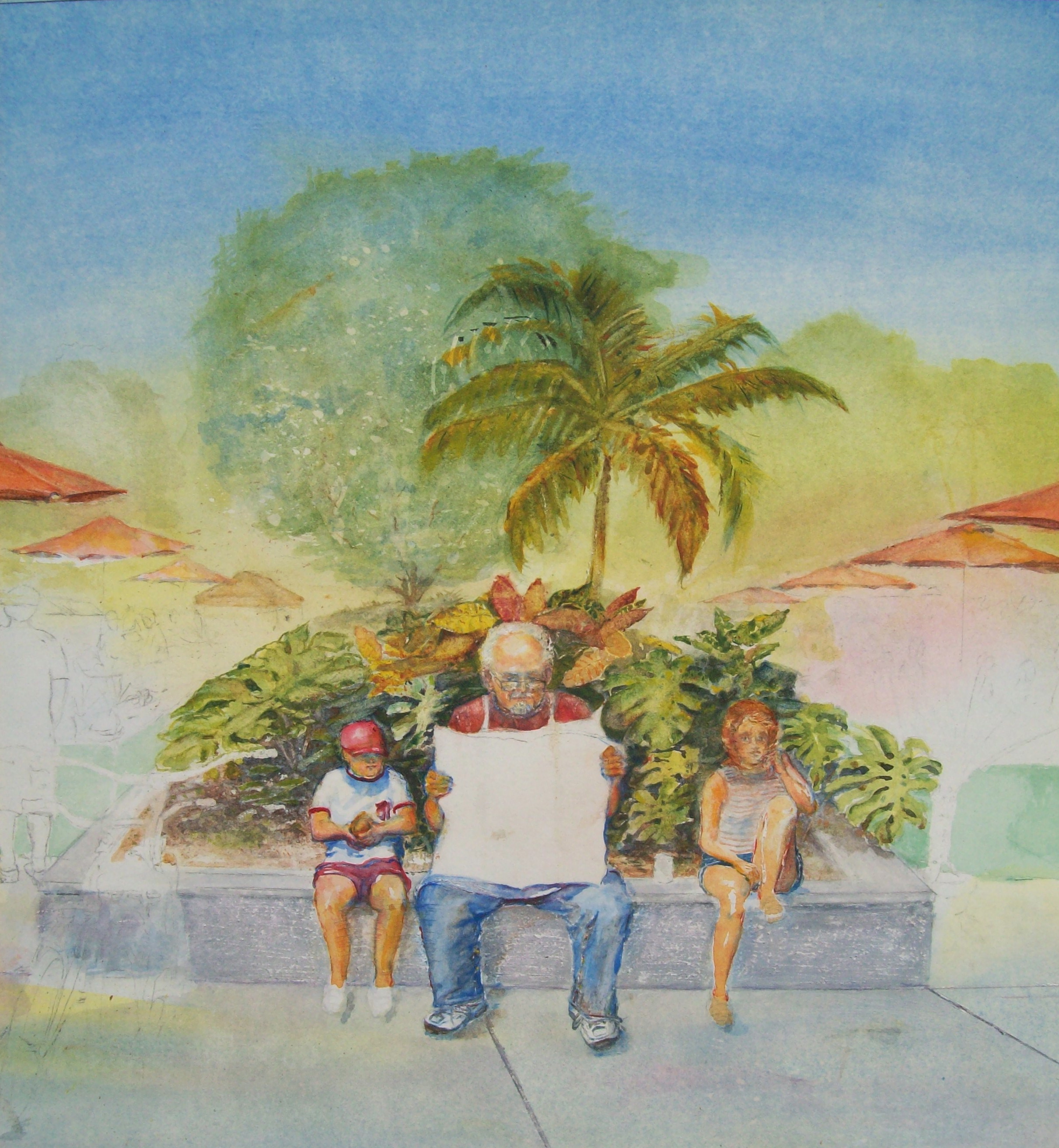
There are several considerations one must factor in when building an art career. The most important is how to juggle the time it takes to create art that can be sold while marketing the work they create. Also, understanding marketing as well as you understand art. By its very nature this forms a dichotomy in a sense because marketing a product is entirely different from having the talent to paint a picture.

Since marketing is generally not the forte of a talented artist, the best market is often the one among the the people they know.

Artist, Richard D. Burton making a full size graphite drawing for "The Old Woodie"
Artist, Richard D. Burton making a full size graphite drawing for “The Old Woodie”

An error many artist make is thinking if they can get into a gallery chain and be seen by people everywhere they could have a successful career and be freed up of the drudgery of marketing. This my be the way to go after one has made a name for themselves, but therein lies the rub. Have they really made a name for themselves? The most fruitful and easiest sales are to the people you know personally.

My suggestion to artists is to start locally with family and friends. If done properly, they can help create a group of local buying patrons that can be responsible for suggesting their friends and other referrals that will open doors. However, as far as your family and friends are concerned, they must understand you are  in business, and there are no freebies. You are selling your art. You are building an art career. Here is something to consider. Have you ever thought of using your family and friends homes as art galleries?…hang your work in their homes for show and sell? They have a painting for a while hanging in one of their rooms, but it is for sale.

All an artist is doing here is networking. For an artist with no understanding of marketing in this manner, there are tons of self help books on the market that assist you in your efforts. These books usually have networking or network marketing in the title and are usually very informative. They are readily available in bookstores or on the internet. I would get the latest and most recent “hot” seller, since there are always new and improved ways to network.

R. D. Burton: "Old Woodie" Acrylic on Board
R. D. Burton: “Old Woodie” Acrylic on Board

We have a new art table coffee book that you enter for when signing up to be a member of our newsletter. IT IS THE BEAUTIFUL SPLASH 14 – Light and Color. If you are not already a member, be sure to sign up and join us. The winner of Collins Big Book of Art is (initials) RCA in the USA.

Splash 14 - Light and Color
Splash 14 – Light and Color


Feel free to make comments about the blog, art, or anything else you find on this sight. We monitor spam carefully, so don’t put us to the trouble, please.

Posted in art, Art Career, Artist, Building a Career, Networking | Tagged , , , | Comments Off on Tip: Building an Art Career

Tip: The Importance of Dark Strokes Against a White Substrate

Richard D. Burton: Moses (Pen and Ink)

I’ve always been impressed by the fresh and crisp look of a well executed pen and ink. Artist who  master this type of art, whether they use crosshatching, dots, horizontal or vertical, continuous line or curved strokes, or a combination of any and all of these, should feel a fascinating sense of accomplishment.

Lynn Burton: Unknown

However, whether one uses pen, ink, paint, charcoal, or graphite pencil, there is hardly any art more beautiful than pure dark strokes against a white substrate. Of course, this is only my opinion. It doesn’t take but a simple kit of supplies – paper (or selected substrate), ink, pen, pencil, charcoal stick, perhaps lampblack paint and brush, and a little motivation to pull off a very intriguing and entertaining piece of art.

The ability to draw is a definite plus for any artist that uses paint as a medium. No matter what the composition of the work, whether it is a landscape or a portrait, the ability to sketch it using black on white helps to determine the values. This helps when understanding contrasting values. The artist will feel much more comfortable and confident when finishing the work in color.

Artist, Richard D. Burton, working on Graphite Drawing: Grinding Gears of Time

My advice to all artists is to have a sketch pad and pencil within arms reach. There are times that I see something that inspires me, and I pull the car off the road and immediately begin to sketch it. It may be something I wish to draw with graphite pencil as a completed work; but there are times I feel it would make a better watercolor or acrylic painting.

Even if I decide to paint my sketches (which usually are hen-scratches), I take the time to make a good graphite drawing that especially works out values for me.

street scene
Quick sketch of street vendors in Miami


The loose sketch of street venders in Miami is a watercolor I am presently in the process of painting. I was not interested in getting anything more than composition in this hen scratching when I sketched it. However, the hard work began with several more thumbnail sketches trying to get the composition the way I wanted it. When I made my final decision, I drew a full size (16″X22″) drawing. To find more information on my progress of this painting in progress, click on the past posts a few posts back and see more detail about it.

Drawing for Watercolor


Be sure to join our newsletter (upper right). One of our members will receive a beautiful art coffee table book.

Also, feel free to make a comment about the blog post…NO spam, please.


Posted in Artist, Dark Strokes, Graphite Pencil, Pen and Ink, White Substrate | Tagged , , , , , , | Comments Off on Tip: The Importance of Dark Strokes Against a White Substrate

Art Tips and Blogposts Revisited

Richard D. Burton
Richard D. Burton

We have selected blog posts and art tips that we feel are worthy of a revisit. They have been very popular. If you see an article that you may have missed or like to revisit, the small picture next to the article discussed will redirect you to the post. As you know, here at ART CENTER INFORMATION, we wish to progress art through awareness.

In the art blog post entitled “Leading The Eye With Color and Light”, we wrote: In my paintings, I like to consider the different ways of leading the eye of the viewer with color and light. The unfinished painting shows an example of this.

It shows red umbrellas vanishing in the distance, creating a directional arrow pointing to the main focus of the painting. This, along with the sheen of sunlight reflecting off the top of the character’s heads, helps direct the viewer’s eyes. Almost certainly, color is the most obvious and elusive element of light.

Watercolor in progress (unfinished)

If you would like to read more about this while watching me slowly progress this piece of artwork, visit the blog post by clicking on the thumbnail to the right>>>>>>>>>>>>>>

Here at the art center, we seem to be a little more than just a little obsessed by light and color. In the blog post entitled “Painting the Characteristics of Light”, We said that there is hardly anything in a painting that matters as much as the light that illuminates it.

Lynn Burton: Little Tea Pot

Light is the energy that makes things happen, and it affects every portion of the painting process by making things visible and colorful. If an artist thinks of it like a separate tool to work with, they can use it to intensify the subject matter. For more information included in this article, click on the picture of the teapot to the left. <<<<<<<<<<<<

Have you ever wondered how artists find their niche? Here is an excellent article that discusses just that in our blog post entitled “How Artist Find Their Niche”. In the article, we mentioned YOU are the magic. Whatever you do, it will be original. This is true even if all you are thinking of is your next work of art or if your total concentration is on an art career. However, you must first make a determination.

Richard Burton: Segment of "The Old Woodie" Acrylic on Board
Richard Burton: Segment of “The Old Woodie” Acrylic on Board

You must ask yourself, “How bad do I want it?.” their are tips here that challenges you to be your best. How bad do you want it? You will never know until you know exactly what it is that you want. If you haven’t already read the blog post, I invite you to do so by clicking on the painting >>>>>>

Finally, the last suggestion we make is the article entitled “Tips: The Thrill of Experimenting”. What artist does not enjoy the new discoveries when we experiment with medium on substrate? In the blog post we mentioned that of all the thrill of painting, experimenting with your art and talent can create moments of complete recreation that seems more like play than work. Is art work? Of course it is; but no one said you can’t have fun wile you work. Be free! Allow the wind beneath your wings and soar the universe of colors and shapes.

Lynn Burton: The Red Sunset" (oil on canvas)
Lynn Burton: The Red Sunset” (oil on canvas)

There are five great tips in this post. To read the complete article just click on Lynn Burton’s painting on the right>>>

Be sure to join our newsletter by clicking on the appropriate place at the upper right of the page. You might be selected to receive a beautiful coffee table book.

We hope you enjoy our blog posts talking about art. We are always trying to improve our sight, and would appreciate your comments which you can make at the bottom of the page. If you have an art blog, feel free to install your link in the comment, however anything that is considered spam will not be accepted.


Posted in art center information, ART COFFEE TABLE BOOK, art review, Art Tips, Artist, blog posts, color, Light | Tagged , , , , , , , , | Comments Off on Art Tips and Blogposts Revisited

Leading the Eye With Color and Light

Watercolor in progress (unfinished)

In my paintings, I like to consider the different ways of leading the eye of the viewer with color and light. The unfinished painting on the left is one example of this. It shows the red umbrellas disappearing in the distance on each side of the main focus of the painting. This, along with the sheen of sunlight reflecting off the top of the characters’ heads, helps direct the viewer’s eyes. Almost certainly, color is the most obvious and elusive element of light.

street scene
Quick sketch of street vendors in Miami

When I loosely sketched the street scene while on vacation in Florida (right), I knew the red umbrellas reflecting the temperature of the sun would make good directional references. Reds, yellows and oranges typically give the impression of warmth. However, the temperature of any color relates to surrounding colors. Keeping this in mind while trying to create a composition that leads the viewer’s eye with color and light becomes a difficult challenge.

Colors tend to expand and contract as they interact with each other. Placing certain colors next to each other will enhance their dimension. Placing complementary colors next to each other causes one color to come forward, while the other recedes. This creates a pulsating rhythm.  Here is a tip to keep in mind while painting: When the light is warm, everything it touches is perceived to be warm; however, warm color surrounded by cool colors will draw the viewer’s attention.  A good example of this is seen in my brother’s painting, The Red Sunset. Cool colors in the shadows will always help balance the warmth of the subject.

Lynn Burton: The Red Sunset" (oil on canvas)
Lynn Burton: The Red Sunset” (oil on canvas)

When attempting to use color and light to direct the viewer’s eye, I try to contrast visual relationships between objects by concentrating on colors, values, size, shapes, depth and texture. Each and all of these will attract attention; and, if used incorrectly (or in error), they will attract attention away from the main focus. This makes every brushstroke important.

Please feel free to leave a comment about the post. I appreciate your comments whether they agree or disagree with my articles.


Posted in color, Color Scheme, focal point, Light, painting, sunlight | Tagged , , , , , , | Comments Off on Leading the Eye With Color and Light

Tip: Under Painting Shadow

Watercolor in progress

When under painting  shadow, I like to consider the shaded area and lay up a wash of Cobalt Blue or Ultramarine Blue in them, especially when painting people.

In this particular painting a Cobalt Blue for the shaded area will be used, since the three selected colors to create the harmony of the painting are Cobalt Blue, Scarlet Lake, and Winsor Yellow. To create a warm skin tone for this painting, the colors used will be a wet Scarlet Lake and Winsor Yellow manipulated by brush to allow the colors to mingle on paper. As shown on the boys shirt and hat and the top of the “elderly” gentleman’s head, saved whites will portray the most brilliant areas of sunlight.

If you study the unfinished painting on the left, you can see the teenage girl has been shaded with Cobalt Blue. I’ve learned by past mistakes made that the under paint must dry to a “bone” dry before laying a wash on top of it; otherwise, the skin tone turns out to be much too dark.

Watercolor in progress

The painting is busy. It will have several other people in it, showing some working beneath the umbrellas selling their wares to visitors stopping by to shop. Others are walking up and down the walk. These, will still have under paintings for shadows with glazes painted over, but not to the detail, nor the same technique as the three in the main focus area.

The farthest away the people are portrayed, their value will lighten. However the technique that will be used is much simpler. Much of the exposed skin area will remain white because of the bright sun glaring off it. I will also use a controlled value of burnt sienna over blue. I can create a real interesting distant skin tone by reversing the technique, using Ultramarine Blue glazed over the Burnt Sienna as the shaded area. It actually gives the sensation of a third color, which plays well with a bright day beneath a shadow of an umbrella.

Do these two things before leaving this sight. (1) Feel free to make a comment (No Spam!). (2) If you haven’t already joined our newsletter, please do (Upper right).


Posted in glazes, Painting Shadows, painting skin color, Paintings, Shadows, Underpainting, watercolor | Tagged , , , , , , , | Comments Off on Tip: Under Painting Shadow

Building up a Painting

Watercolor in progress

The watercolor that I am in the process of completing is beginning to vex me not a little. Building up a painting is a slow methodical process. The ease to err is somewhat overwhelming, and although there are times of panic, there are also moments of exhilaration.

It is important that an artist plan their washes and glazes. I find this rule never more true than in this painting. The foliage behind the characters in the picture can easily become muddy with too much glazing. For this reason I’ve allowed no more than three glazes of paint in any area.

Watercolor in progress

Any time I am painting, I have to fight impatience. I don’t think I am that much different from many artists. We all want a masterpiece to come together in an hour or less, but with watercolors one must learn to let them completely dry before trying to build up the colors, unless you are working wet into wet.

It helps if you are working on more than one painting at a time. This way, you can be working on one while the other dries.

As a painting is built up, there are two frustrating problems that tend to arrive. The first is knowing when to step back, review, and stop. If you don’t, the second problem tends to occur, and that is the appearance of mud. This is why I have a discipline to not touch the same spot more than three times.

When all that is needed in area is a simple wash, then use only a simple wash. Don’t be afraid to use enough of a color in the brush than relying on building up the color so much. When I first began with watercolors, I felt I had to use less paint and more washes to build up the color, but now I am more brave with using less wash overs.

Enter to receive our newsletter (upper right).

Make a comment (in the comment section below) about the post. No spam, please.


Posted in Building up Painting, glazes, painting, washes, water color | Tagged , , , , | Comments Off on Building up a Painting

Painting the Characteristics of Light

Lynn Burton: Untitled (oil on canvas)

An awareness of light and its subtle qualities is necessary for artists that wish to make dramatic paintings. Light is the difficult characteristic that separates the delightful from the mundane. It is the different nuances of light that help determine the mood and character of your subject.

There is hardly anything in a painting that matters as much as the light that illuminates it. It is the energy that makes things happen, and it affects every portion of the painting process by making things visible and colorful. If an artist thinks of it like a separate tool to work with, they can use it to intensify the subject matter.

Light is all around us. It is everywhere. However, finding the best light for a subject to paint is challenging. Most of the time, an artist hasn’t the luxury of waiting for the moment when everything comes together at once and works out perfectly. So, understanding the subtleties of light on a subject becomes very important when altering reality to achieve an aesthetic effect.

Richard D. Burton: Winter Kindling

Because of the transparency of watercolor, it is especially suited to portray luminous surfaces and suggestions of atmosphere and other complex subtleties of light. The technical range of watercolor is exciting, to say the least. With the blending of pigments layered transparently over white paper, an artist can create the most delicate of images. The technical range of the medium is exhilarating.

There is nothing easy about watercolors; however, the challenge they bring can become addictive. This is especially true when portraying light. With it an artist can create dark and powerful moody images, as well as floating pale washes.

There are no strict guidelines for an artist to use when portraying light. One must experiment around until they find their own boundaries and rules. When they feel they have finally discovered the secret of painting light, they realize they have just begun.

Be sure to sign up for the Art Center Information newsletter.

Posted in Artist, Light, painting, watercolor | Tagged , , , , | Comments Off on Painting the Characteristics of Light

Selecting the Right Palette for the Painting

Under painting of watercolor

I prefer to use as limited a palette as possible, because it offers more flexibility in creating a range of colors by mixing. In the watercolor painting that is in a state of “work in progress,” I have several things in mind that I wish to accomplish. First, my desire is to create an entertaining painting that is colorful, harmonious, somewhat festive, and that suggests a story.

Graphite study for a watercolor painting
Drawing for Watercolor

The palette consists mostly of reds (Winsor Red, Cadmium Red Pale, and Scarlet Lake), Yellows (Winsor Yellow and Aureolin Yellow), Blues (Cobalt Blue, French Ultramarine Blue, Antwerp Blue, and Cerulean Blue), Siennas (Burnt and Raw), and Payne’s Gray.

I usually do not get involved with a composition as complicated as this one, and consider this to be an experiment that has turned out to be therapy. I’m not certain I needed it, but I persist on no matter how frustrated I get. For this reason, it’s coming along while I work on other projects.

Work in Progress
Work in Progress

I especially like to mix greens from the palette. I know just using Antwerp Blue, I have at least eighteen different greens (mostly on swatches…not in this painting).  In an attempt to get a feeling of harmony, I painted around the entire picture using soaking wet Cobalt Blue on the outer ring, Scarlet Lake dribbled around the middle ring, and Winsor Yellow in the interior.

It took me a while to decide to discard some of the more staining pigments. I’ve completely done away with most all greens, and one of my favorite colors, alizarin crimson. I must be able to ‘lift’ and manipulate paint when it is on the paper. Many of the greens (especially Hooker’s green) and alizarin crimson just will not allow this.


Posted in color, harmony, painting, palette | Tagged , , , , , | Comments Off on Selecting the Right Palette for the Painting

Tip: Capturing the Reality of the Scene

Lynn Burton: Bluebonnets on a Cloudy day - Oil on Canvass
Lynn Burton: Bluebonnets on a Cloudy day – Oil on Canvas

One of the most important factors affecting a painter’s growth is to work on-site and out side~Lynn Burton

Our founder’s brother, Lynn Burton, says he can’t wait for spring to arrive each year. “That’s when the bluebonnets bloom,” he says. “On Sunday afternoons, I like to grab my art equipment and head out exploring for that perfect picture…don’t know how many hundreds of bluebonnet landscapes I’ve done over the years. What a solace…almost like visiting God”

Actually, Lynn likes to keep paint sketching equipment with him in his work truck all the time. “Don’t know when a quick sketch with my water color or acrylic pack presents itself. It’s a must, an artist must be prepared, even if they have a “real” job other than being an artist. Most of the time, if the scene in front of me looks like it can make a decent composition, and I don’t have the time to do a complete painting, I’ll not only try to mix the colors I’m seeing, but I’ll also take photographs. Everything can be worked out later in the studio. I just want to make sure I capture all the proper values and hues that I’m seeing.”

Lynn feels the reality of being present in a place where people and objects make a particular impression worthy of an artist’s capture is the ultimate experience. “It’s hard to explain the excitement you feel as an artist when you capture the reality of a scene. I’m not talking about a realistic painting~I’m talking about the reality of the scene.” He said. “For example, the painting I did that my brother named, The Red Sunset, is an example of what I mean.”

Lynn Burton, "The Red Sunset" Oil on canvass (24x48)
Lynn Burton, “The Red Sunset” Oil on canvass (24×48)

“Sometime back, I was out in west Texas painting a sign. There were a group of horses running around in a fenced field past where the sign platform was placed off the highway. The horses seemed so joyful and were playful, and all throughout the day I kept thinking, ‘there’s gotta be painting here, somewhere’.

As I was putting my sign equipment away, the sun was just beginning to set, and the sky turned to that beautiful red that only happens in west Texas. Suddenly the horses really became exuberant, running and bucking around. This was such in exciting scene, it had to be captured! My art equipment had already been set up earlier, because I knew at some point the desire to paint would strike. I snapped some quick photographs of the horses, and instantly began mixing colors so I could capture the scene.”

Tip: An artist can work both ways, directly and indirectly (on-site and in the studio), so why not take advantage of it. The benefits of experiencing painting outdoors far outweigh any disadvantages, even if all that is accomplished is to capture certain values and hues or ideas for composition. Most anything an artist does to capture the reality of a scene and create an impression on the viewer is a benefit.


Posted in Artist, Lynn Burton, painting | Tagged , , , , , | Comments Off on Tip: Capturing the Reality of the Scene

Tip: Liven up Your Watercolor

100_2136

“Let your darks be dark and your lights light“~Howard Pyle

Tip: Do not consider all accidents in your painting a “ruin” of the painting. Many accidents can be turned into “happy” accidents. Artists are creative by their very nature. Use your creative imagination when an accident occurs and see if you can use it to advantage. Accidents in the form of strokes, glazes and washes may be used and (in many cases) should be retained.

Tip: If areas of your painting seem flat or bare, use a dry brush technique to liven it up. For example, if you have a highway or road, a brick wall, that seems flat and uninteresting (unless it is planned), you may want to dry brush “cracks and holes” into the area. This is especially true if you do not over  do it. Keep it simple but not dull.

Tip: Be aware of the values. Too much mid-tone will leave your painting feeling flat, while too much light colors in the painting will leave it lacking spirit and vitality. The painting will lose its luminosity if has too much dark value. The good news is most all of these “happenings” can be corrected with lifting, glazing, dry brushing, splattering, cropping, and etc.

Tip: When correcting mistakes, constantly keep in mind the danger of “over-working” the watercolor and making it muddy.  The above tip suggests ways of livening up your painting, but if it is over worked, it may be ruined.

Richard D. Burton: Winter Kindling

As an artist and writer, I could probably write an entire book about ways to save and liven up a watercolor; however, sometimes the painting works best if proper planning is done before the paint hits the paper.

Tip: Every painting is your own individual expression. It represents how you think. Before beginning, do your mental exercises considering the (1) focal point, (2) tone, (3) color, and (4) balance.

Posted in art, Artist, painting, Richard D. Burton, watercolor | Tagged , , , , , | Comments Off on Tip: Liven up Your Watercolor