Red Barn Texas Wedding Part Deux

Richard D.Burton
Richard D.Burton

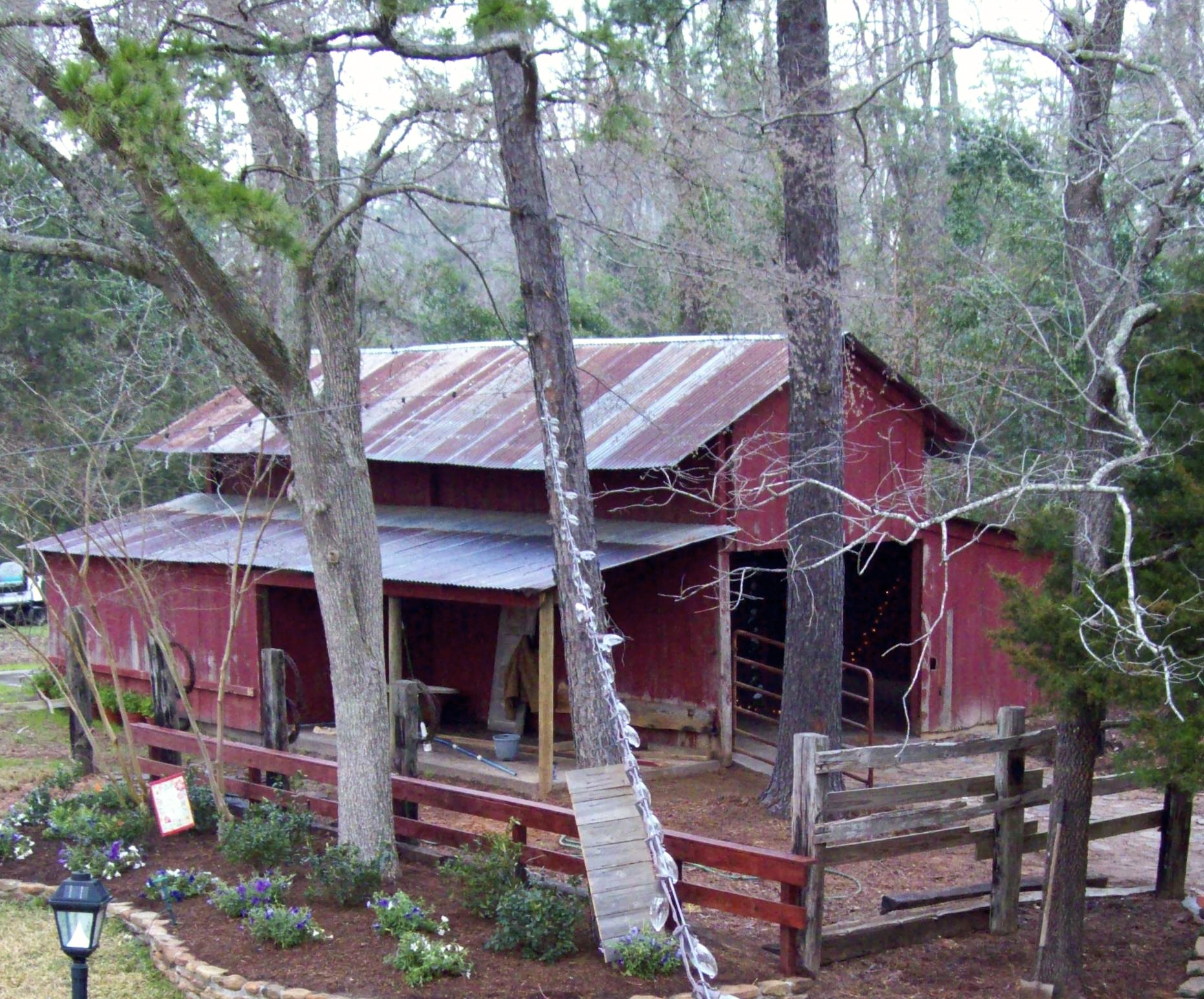
My wife, Nancy, and I zipped down to Texas on March 5th to spend time with my daughter and her husband as they prepared for my Grand-daughter’s wedding which was to be held on their estate in an old red barn three days later. If you haven’t already read the blog post prior to this one, I would advise you to go there first and read it before you read this one. It’ll make more sense.

Richard D.Burton
Wedding locator signage

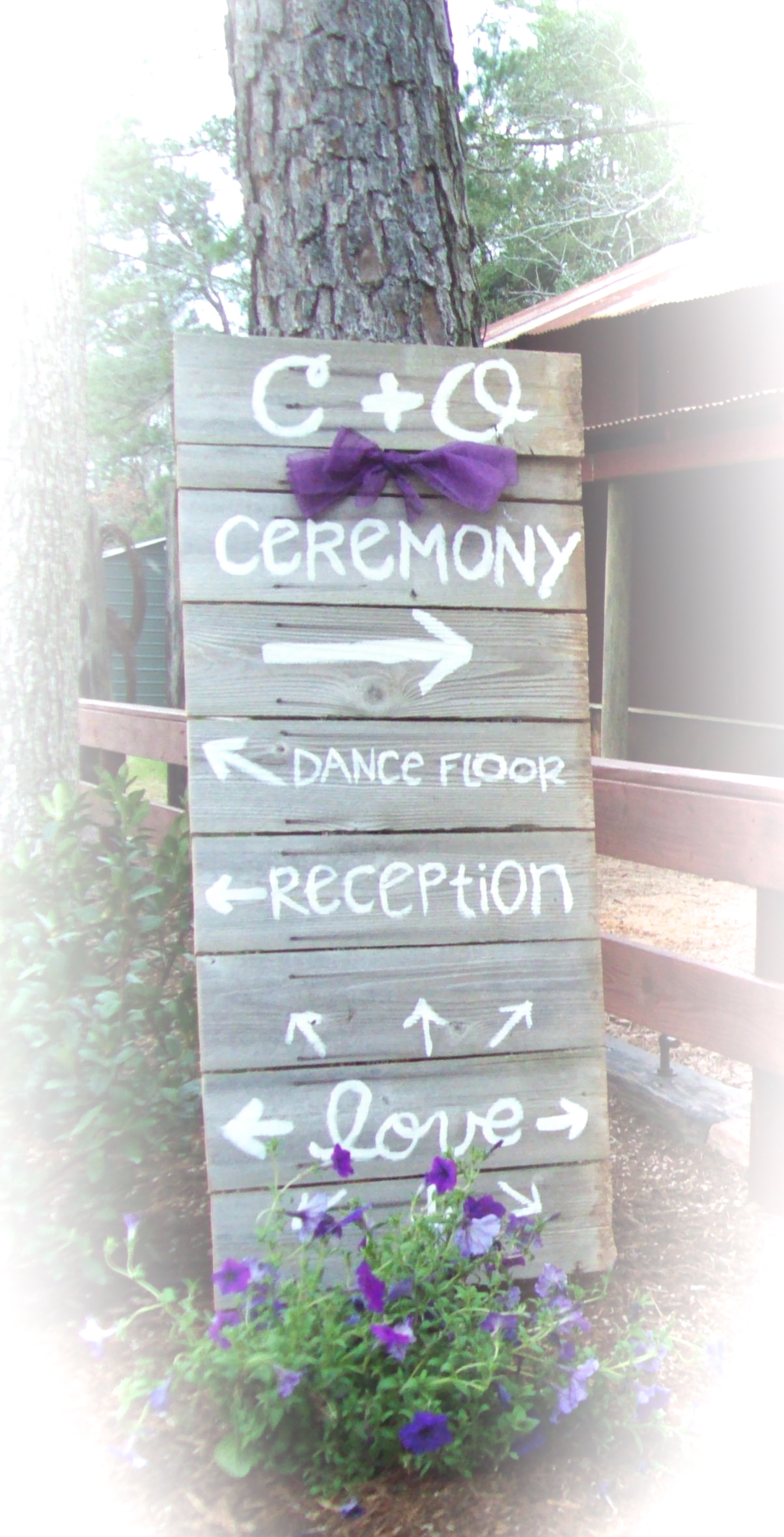
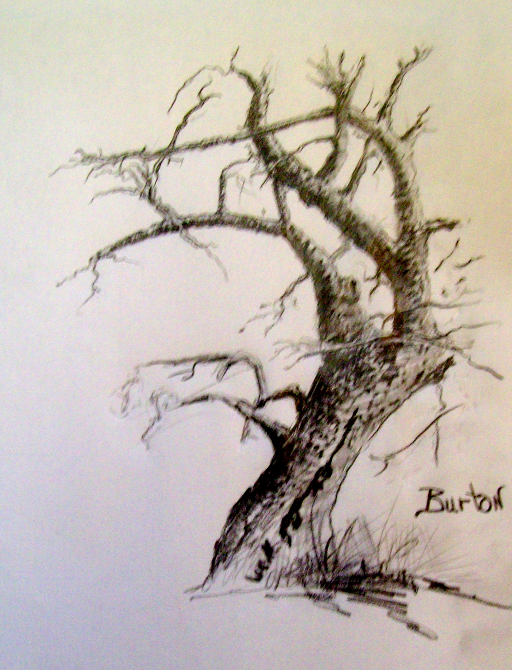
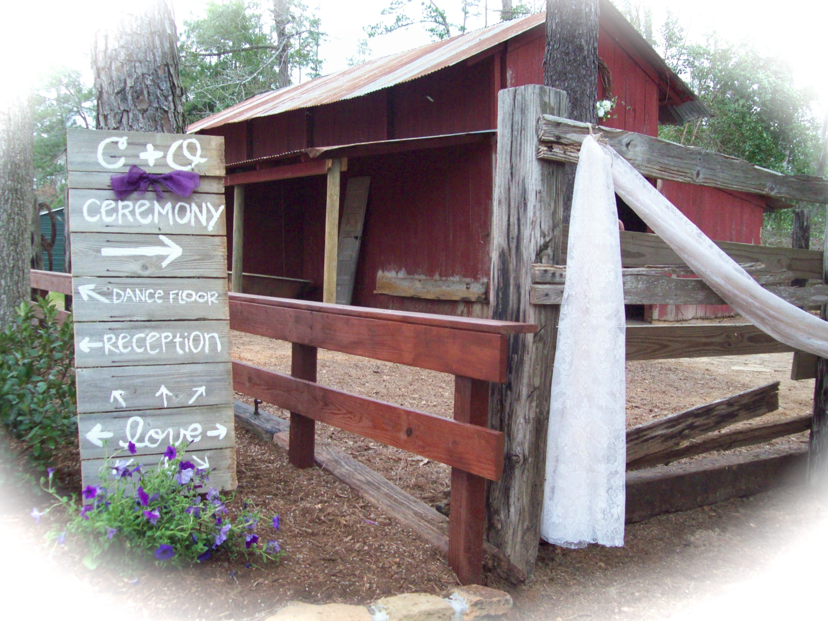
Just outside and to the left of the red barn, and gently placed in a recently new landscaped flower bed, was a locator sign that directed visitors to the different areas of activity on the estate. Olivia made the signage. I felt this was a typical “Burton” thing to do since she came from a family of sign painters (her great-uncle, artist Lynn Burton, and her great grandfather, the late artist Arlen Burton). Me? I couldn’t paint letters for any amount of money.

Red Barn
Red Barn Patiently waiting the inevitable

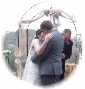
Early in the morning of the wedding day, I walked the area. I couldn’t help but feel anticipation in the well prepared grounds, as if they were speaking to me. On this day two young people would make a commitment of sincerity that would be life changing, and, hopefully, from my point of view and desire, life creating. It was going to be a good day…a day committing to the prolongation of my family line. Yes, indeed! It was going to be a good day.100_2341

wedding
Wedding

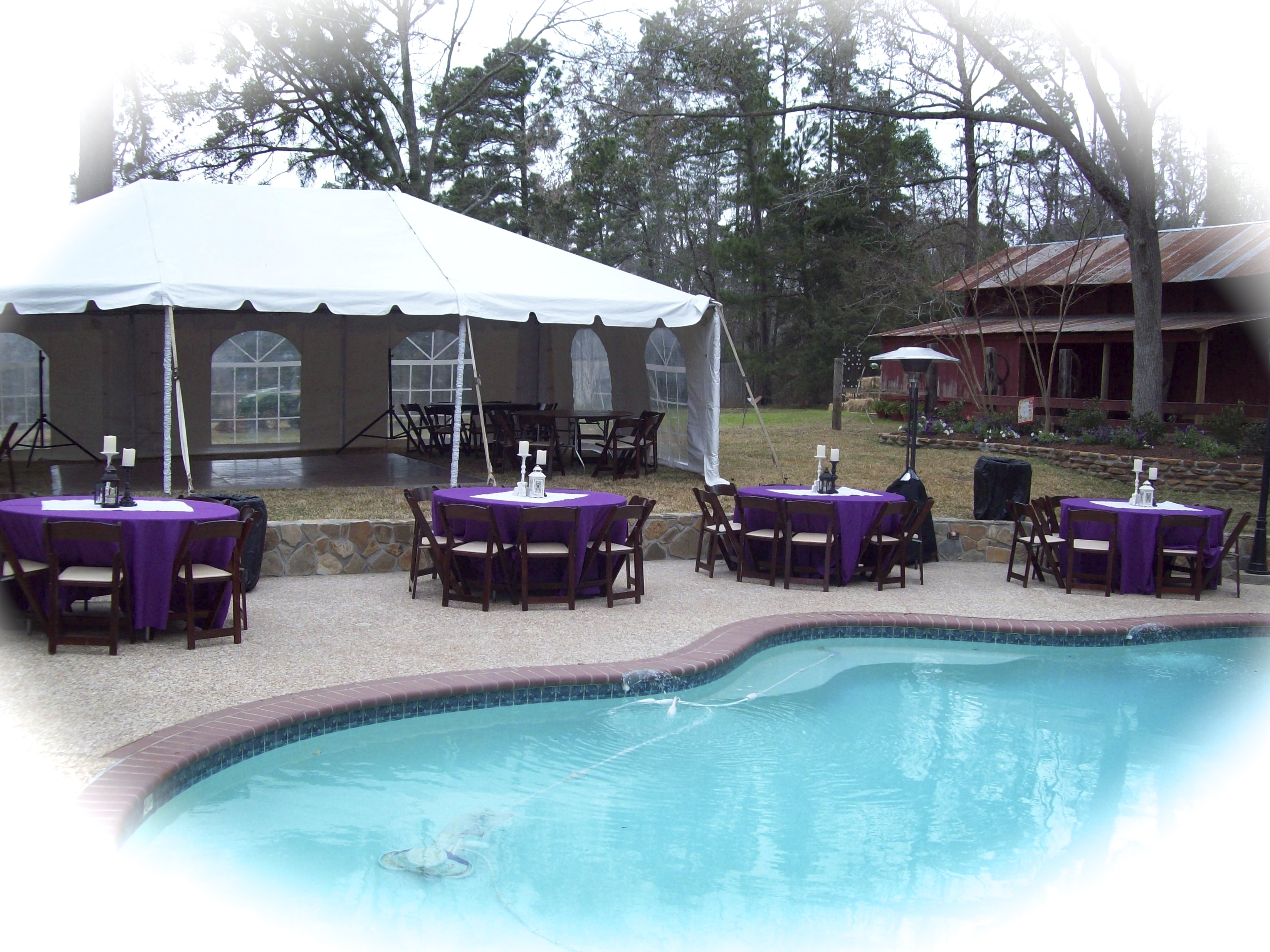
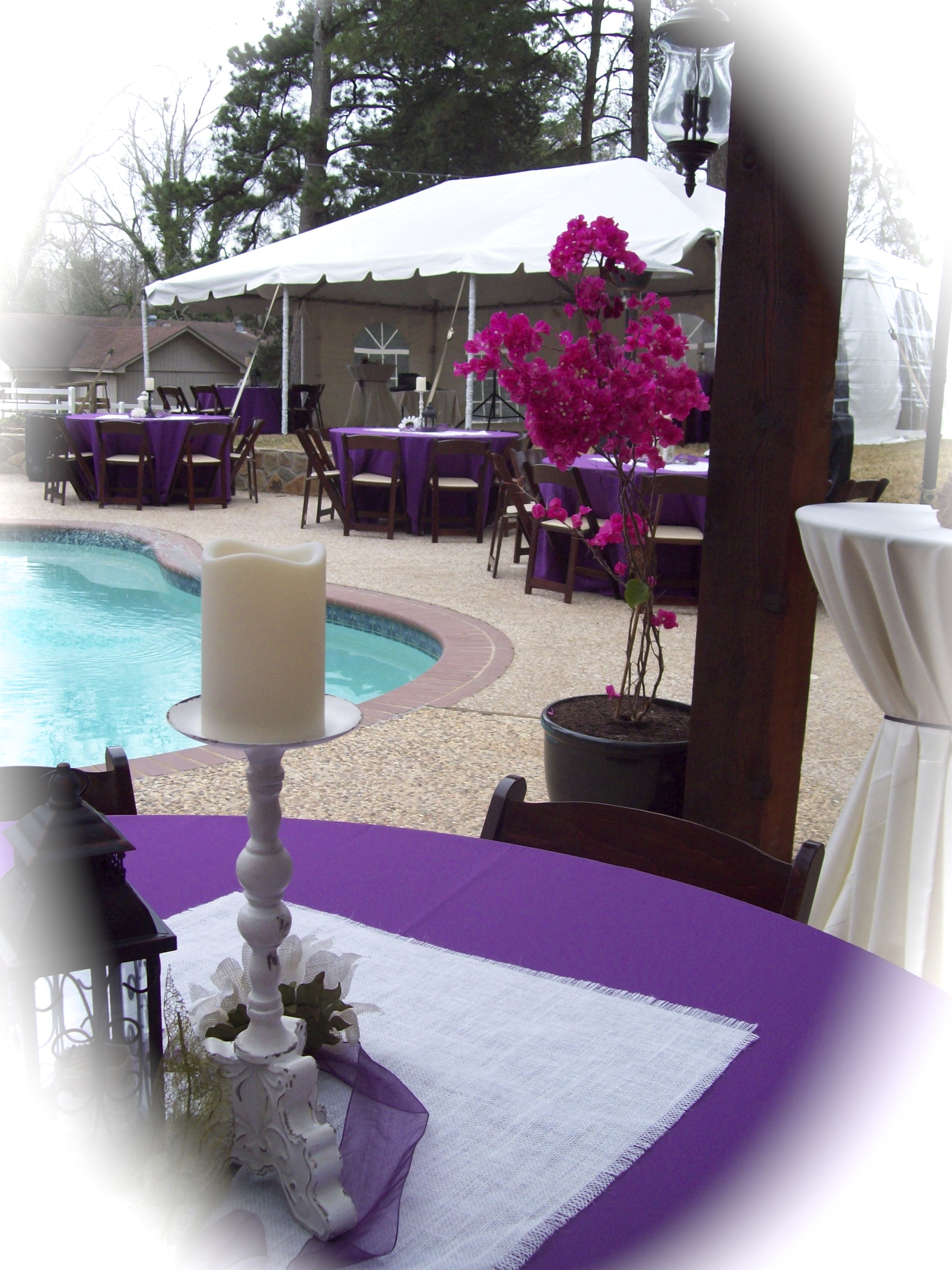
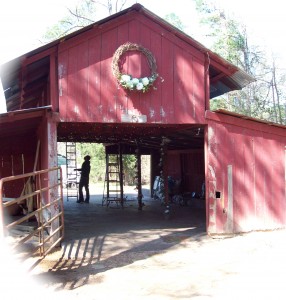
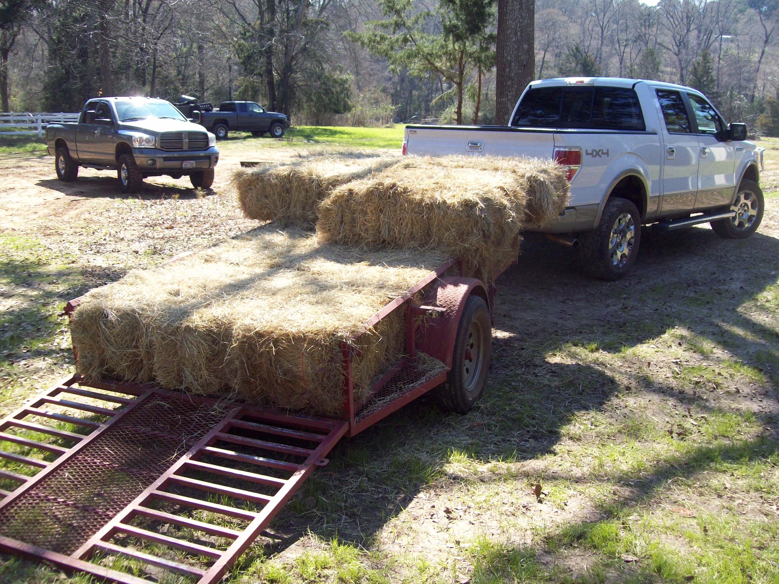
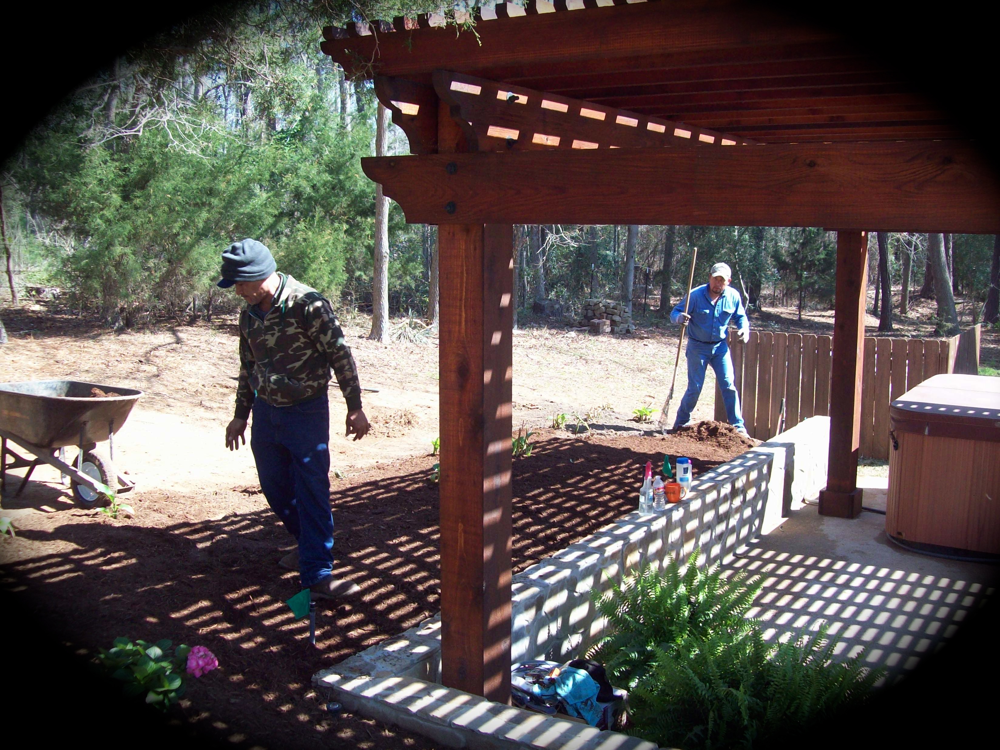
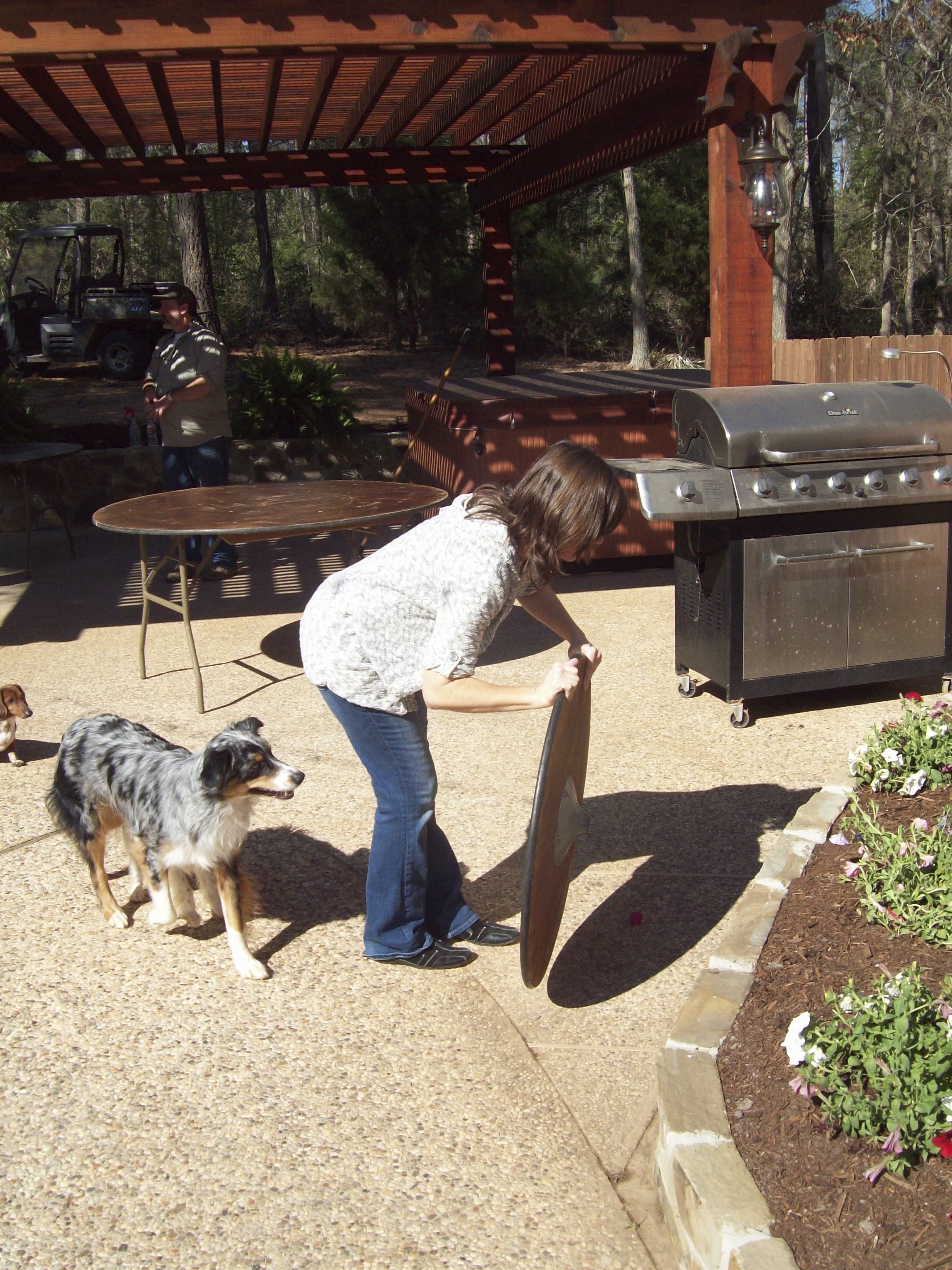
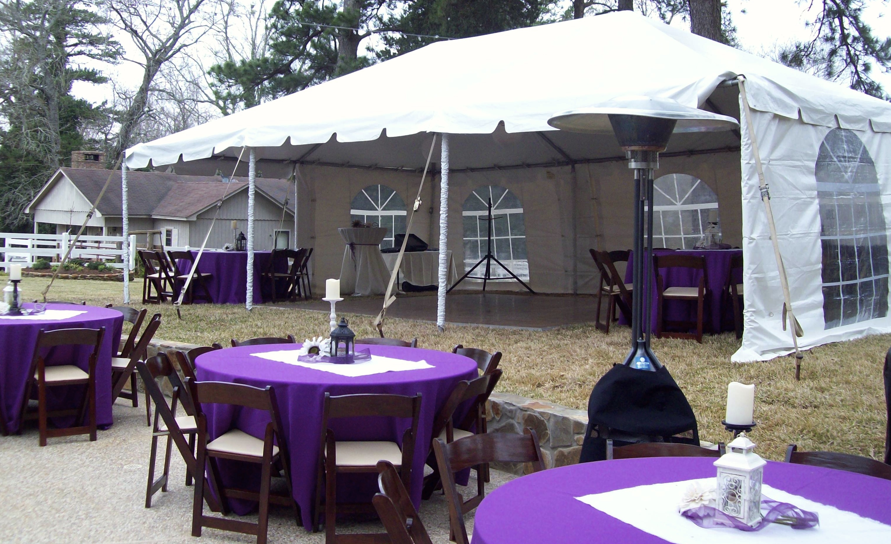
The scene in back of the great house was beginning to appear near ready for the guest reception. The tent was up, the dance floor was in place, candles were placed on tables, and the empty chairs screamed for frivolity.

Tent, table, and candles~estate small house in background
Tent, table, and candles~(estate small house in background)

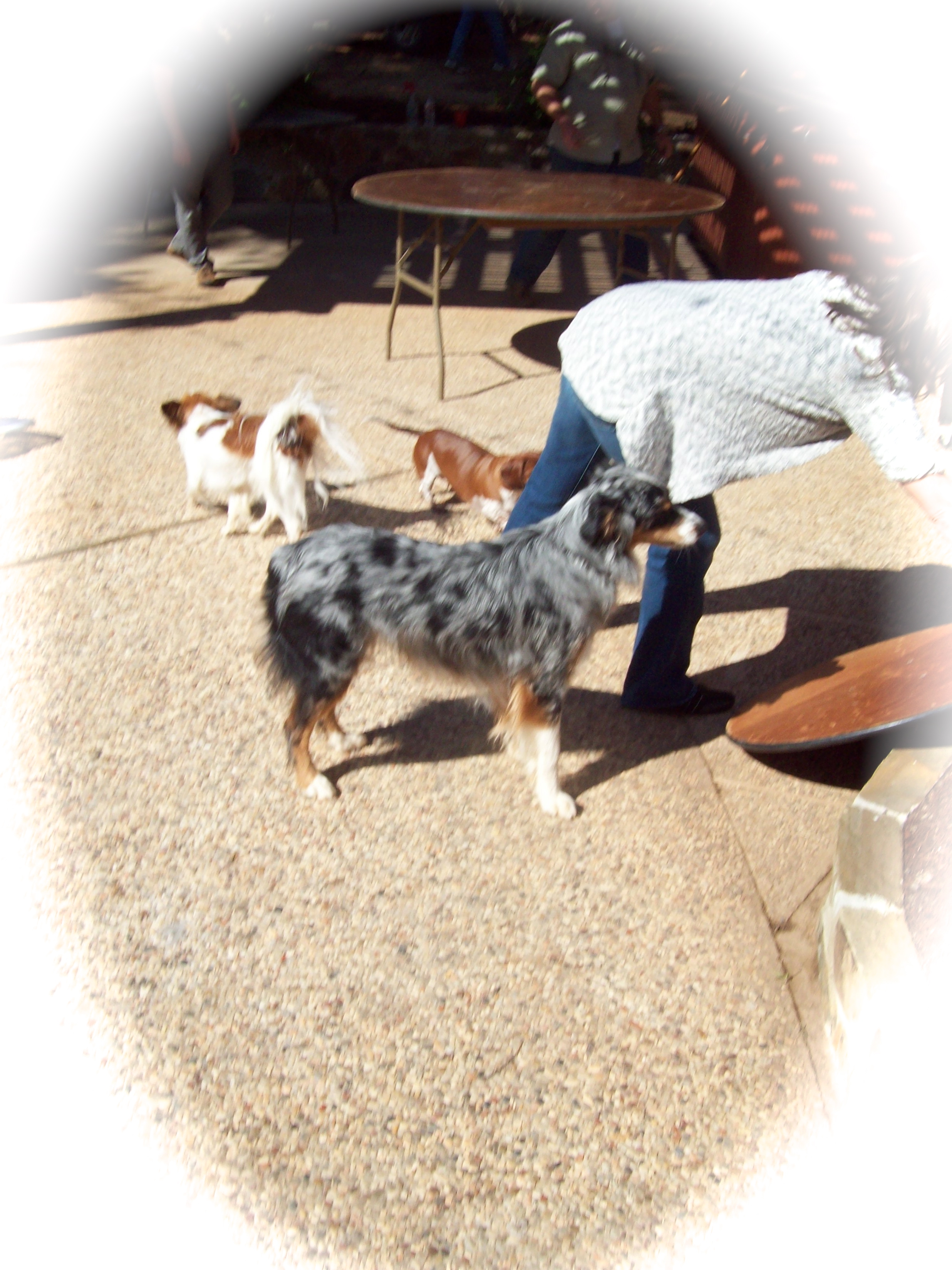
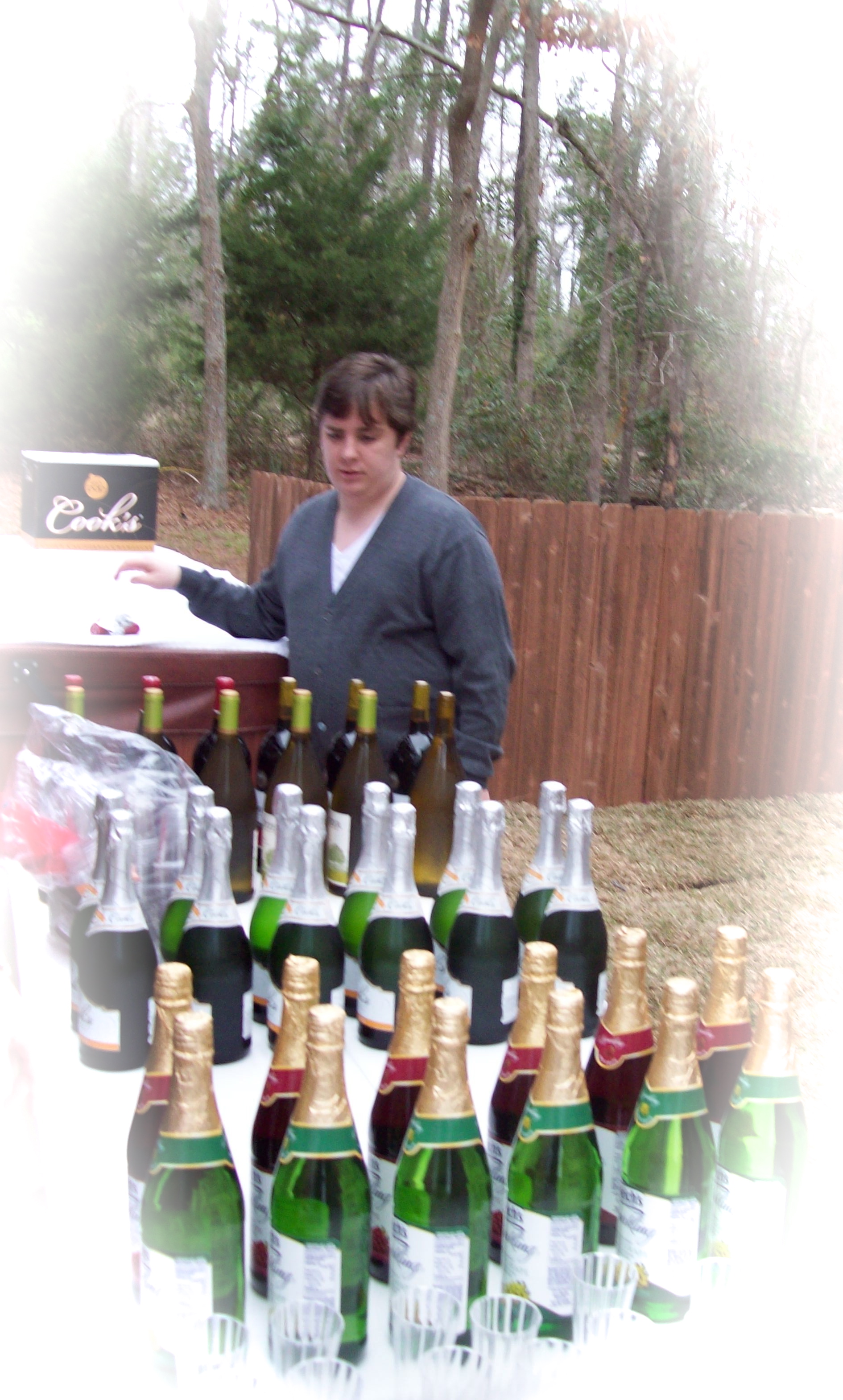
Olivia’s brother #3 was looking over the outside area, making certain all was in order, especially the wine, sparkling grape, and champagne.

Brother #3 inspects the drinks

So, the outside is shaping up, but what about the inside?

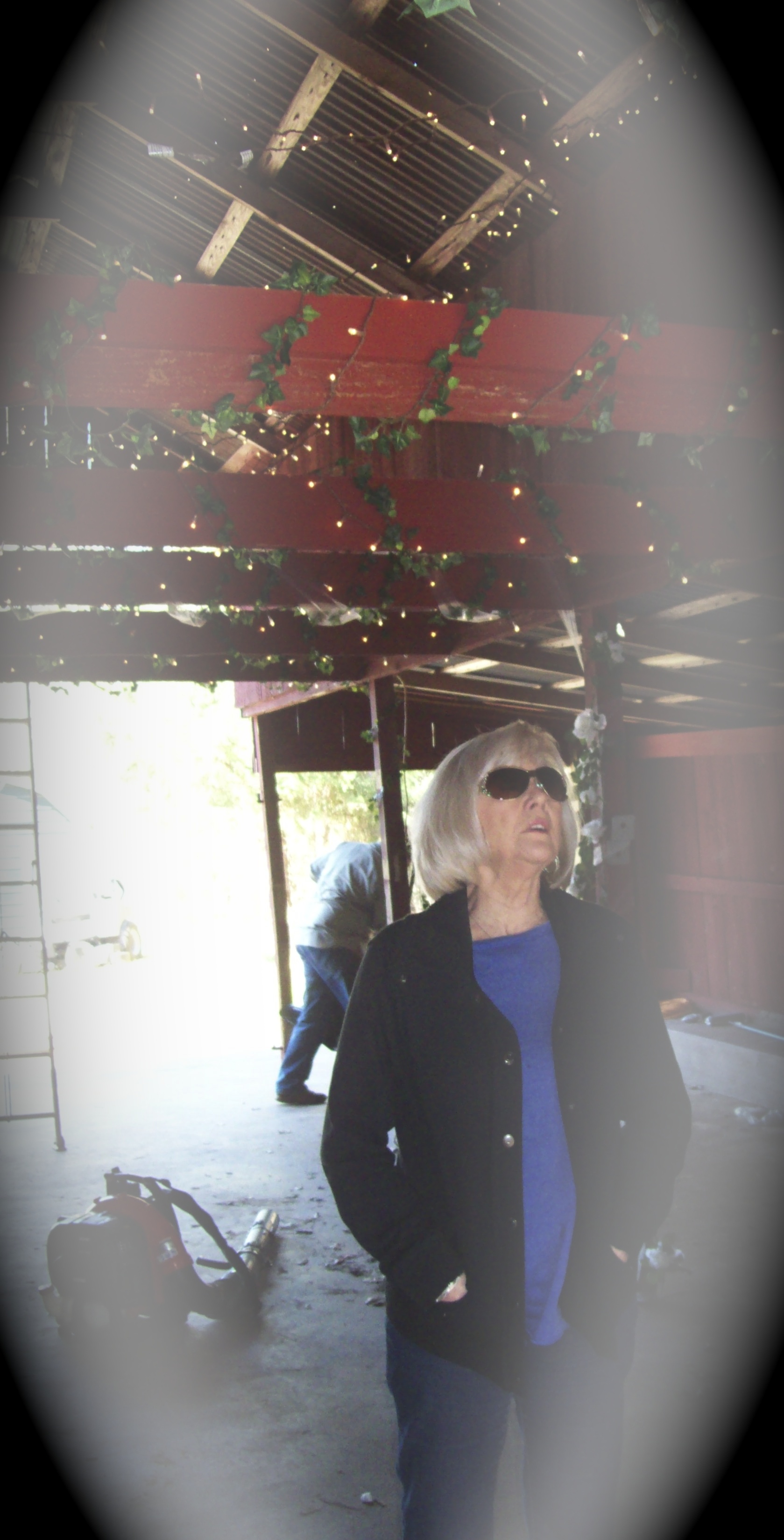
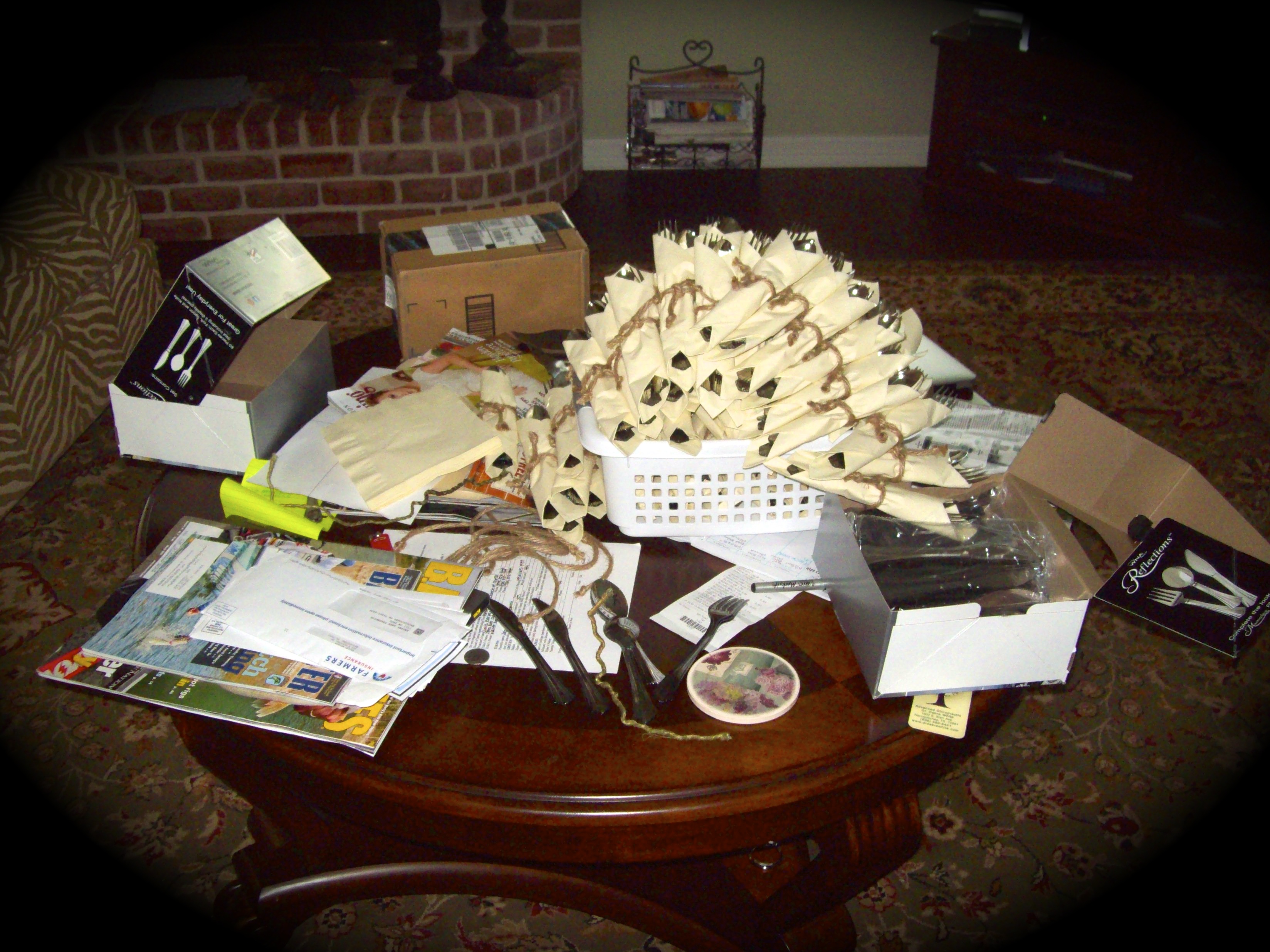
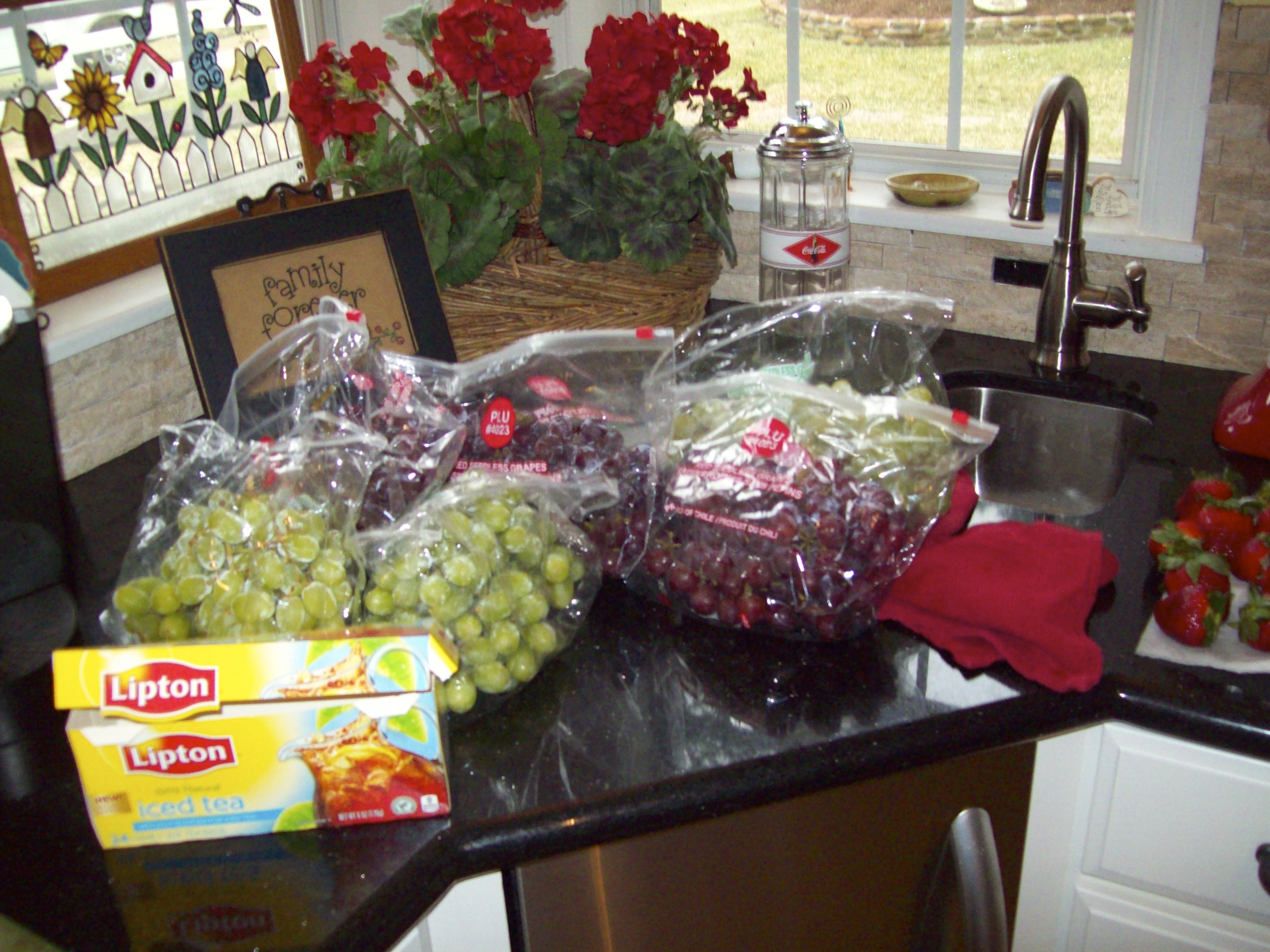
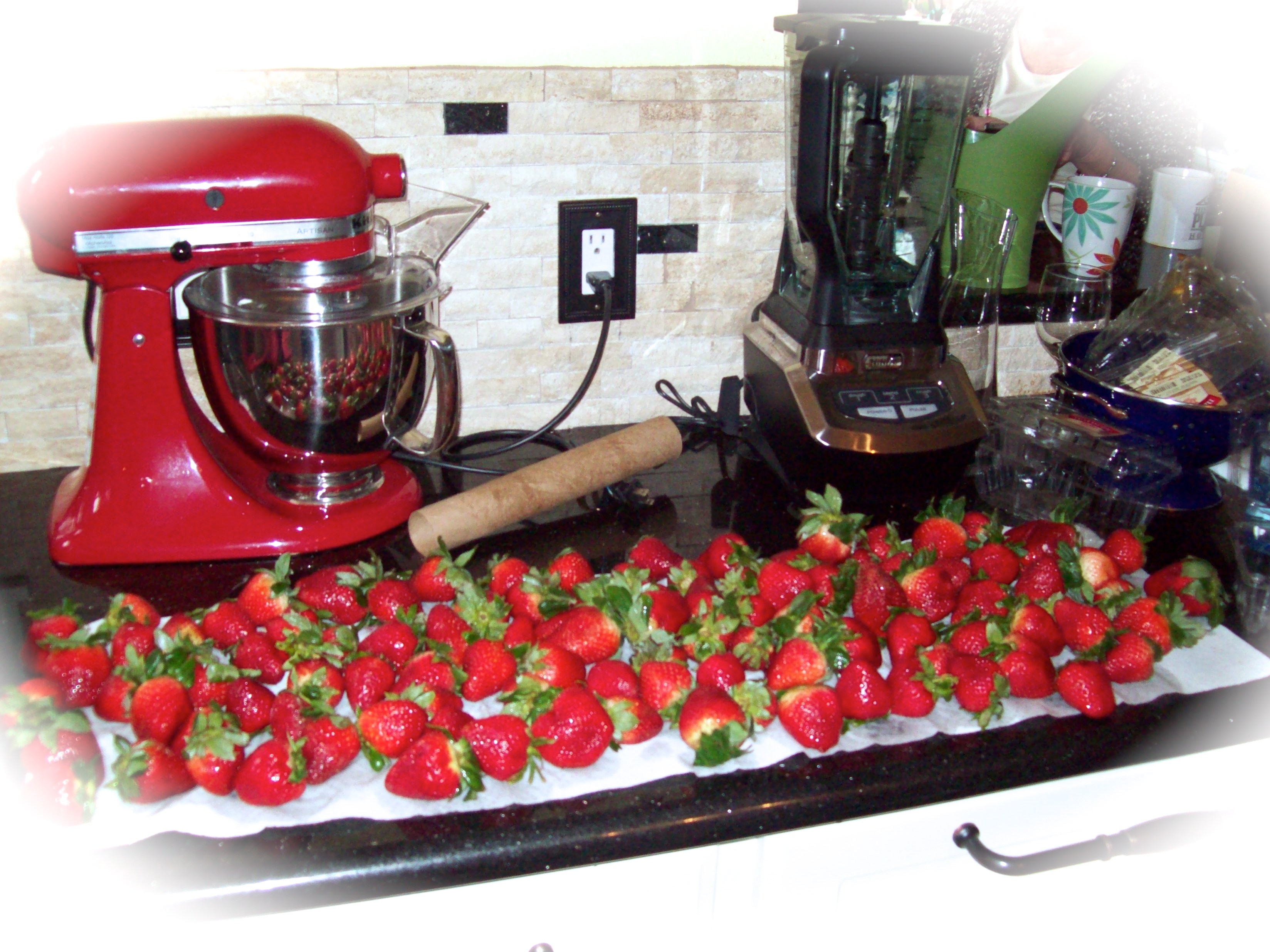
One can not walk inside without being encircled by a threatening order surrounded by a cacophony of disorder. A simple glance at the family room coffee table filled with over a hundred utensils wrapped in a wedding napkins makes my case.

Grandmother Nancy at the top...Step grandmother Nancy at the bottom...toasting glasses in the middle
Grandmother Nancy at the top…Step grandmother Nancy at the bottom…toasting glasses in the middle
utensils rolled in napkins

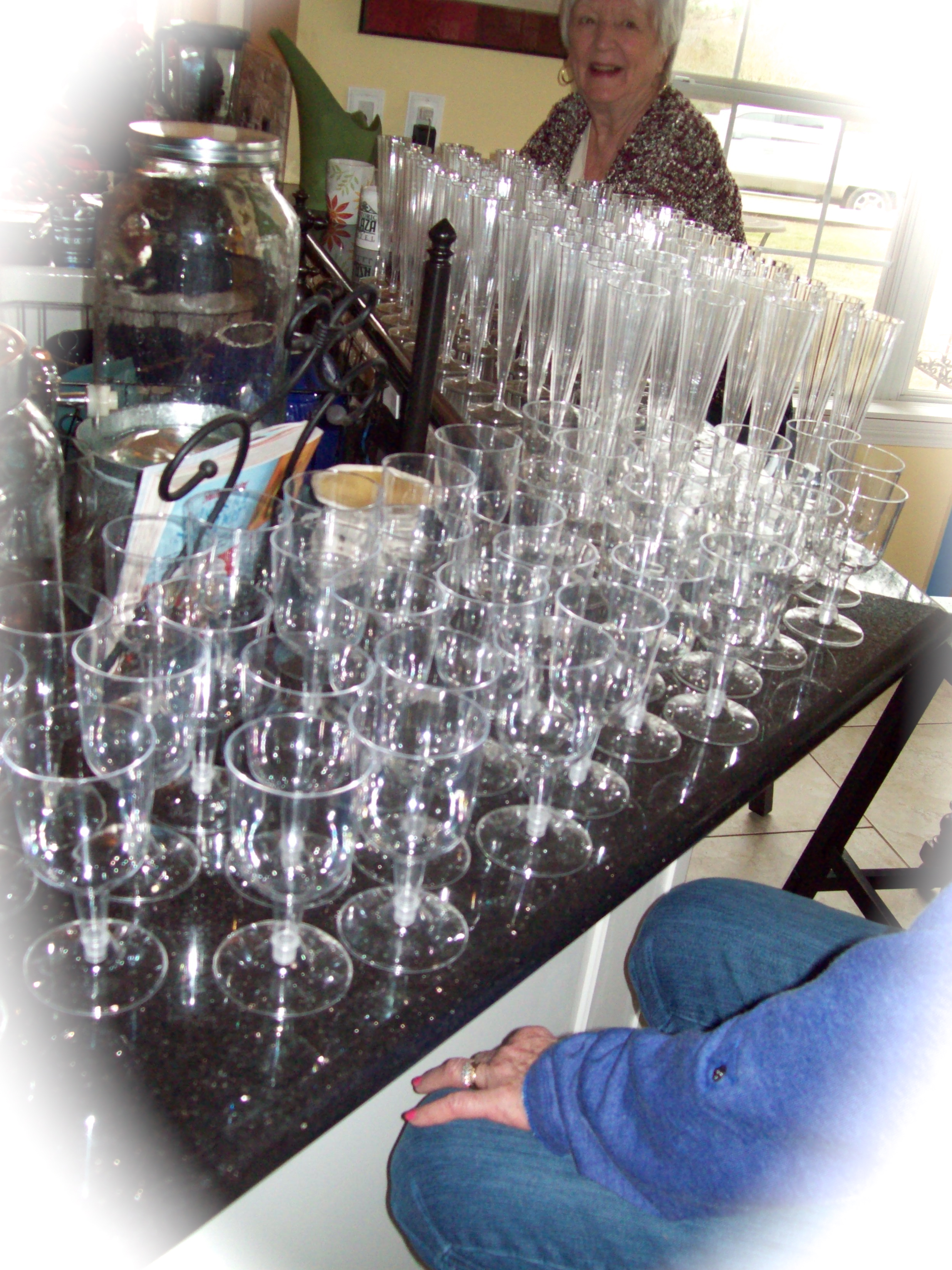
Two grandmothers (one a step, but both named Nancy) patiently assembled the toasting glasses. It had been many years since the two women had the opportunity to see each other, and the reunion was a pleasant one, especially to meet again under such positive conditions.

Two grands-one mother-sister#1-and a wedding planner

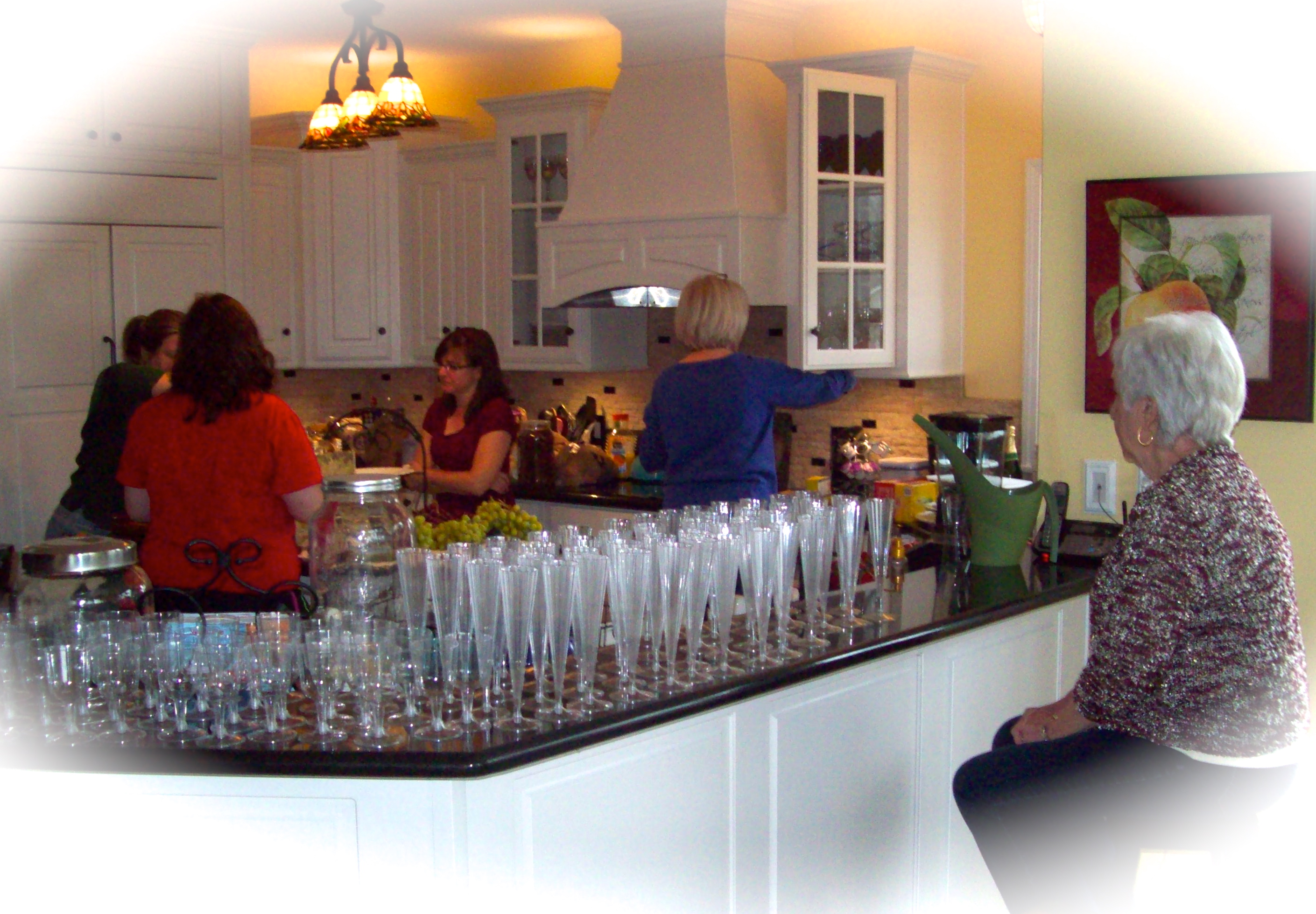
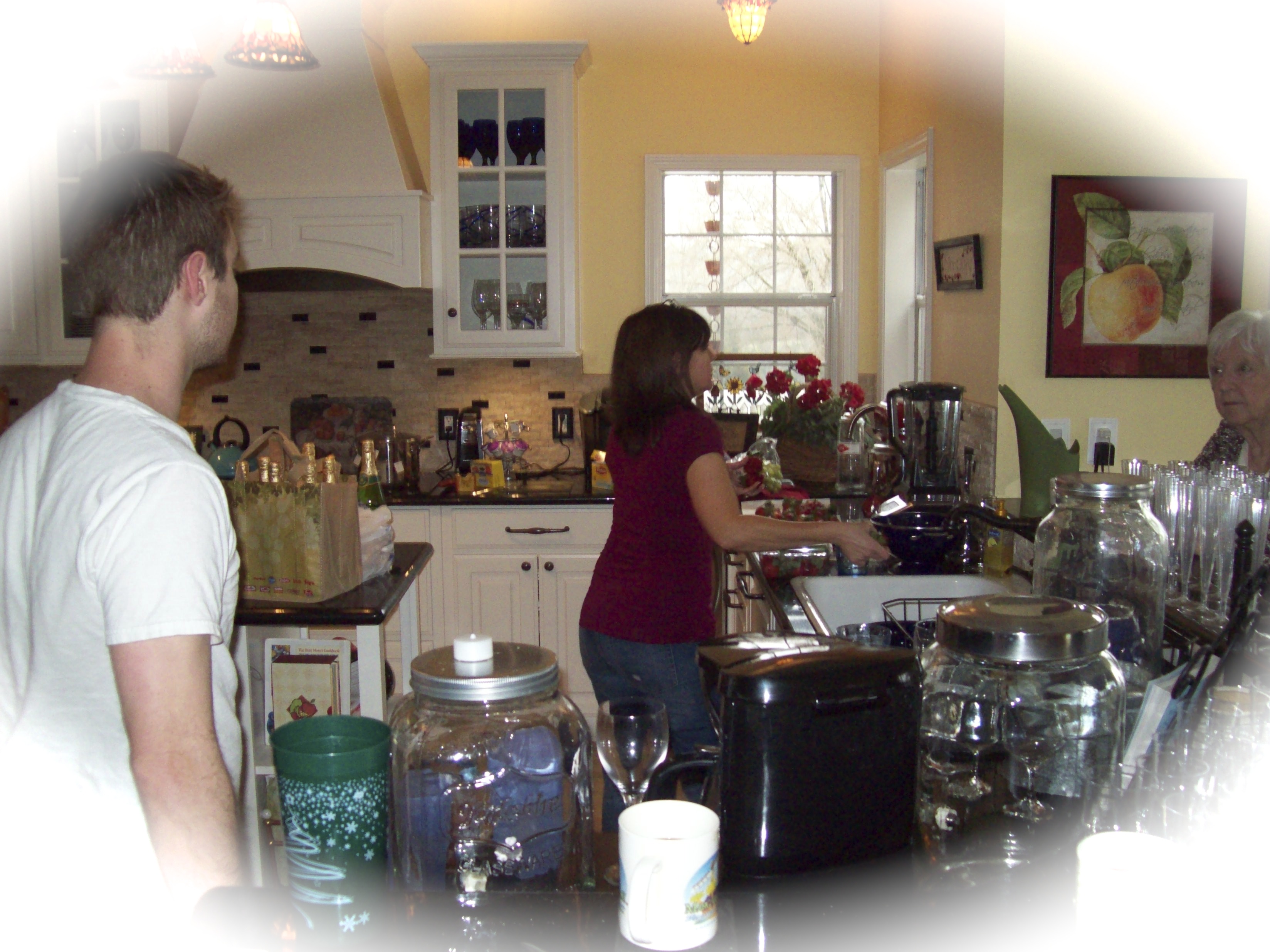
It was obvious. The inside of the house was mostly controlled by women. Surprisingly, I was able to slip among them without them knowing I was there as I doggedly shutter snapped my camera. One exception was Olivia’s brother #1 who always seems comfortably walking among the many and the great.

Sib#1 and mother talking to Grandmother

It seemed as if everyone had a part, as if all was a well scripted play. This was the late morning on the day of the wedding. The ceremony was planned to take place promptly at 4:00pm and I wasn’t certain everything would be ready no matter how well scripted.

Outside, there was an overcast of clouds with a 40% chance of afternoon showers predicted. Grandmother Nancy kept saying, “Not to worry…it’ll hit thirty miles South of here…not here at all.”  We all hoped she was right, because rain is not what we wanted since the bride and groom were going to be saying their vows outside of the barn on a wooden platform. “Not to worry,” Mother Andrea kept saying. “If we must they can say their vows in the dance tent or the house.” The women seemed so comfortable, controlled and unconcerned. I think they were faking me out, but I did think there was going to be a wedding.

A disorganization of order
Fruit for the wedding

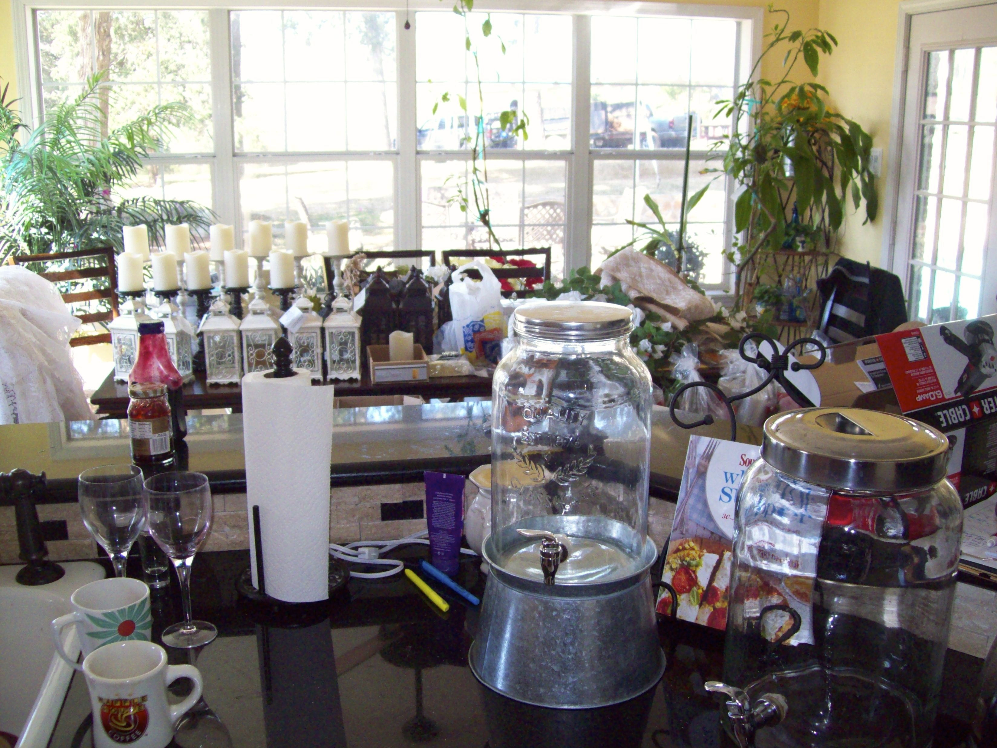
Order persisted to threaten disorder throughout the house, and until each item was placed in their planned space would the disorder persist.


Strawberries awaiting a chocolate bath


It didn’t matter that everything at this time seemed a little disorganized, the wedding planner wasn’t showing any signs of panic or confusion, so why was I concerned?

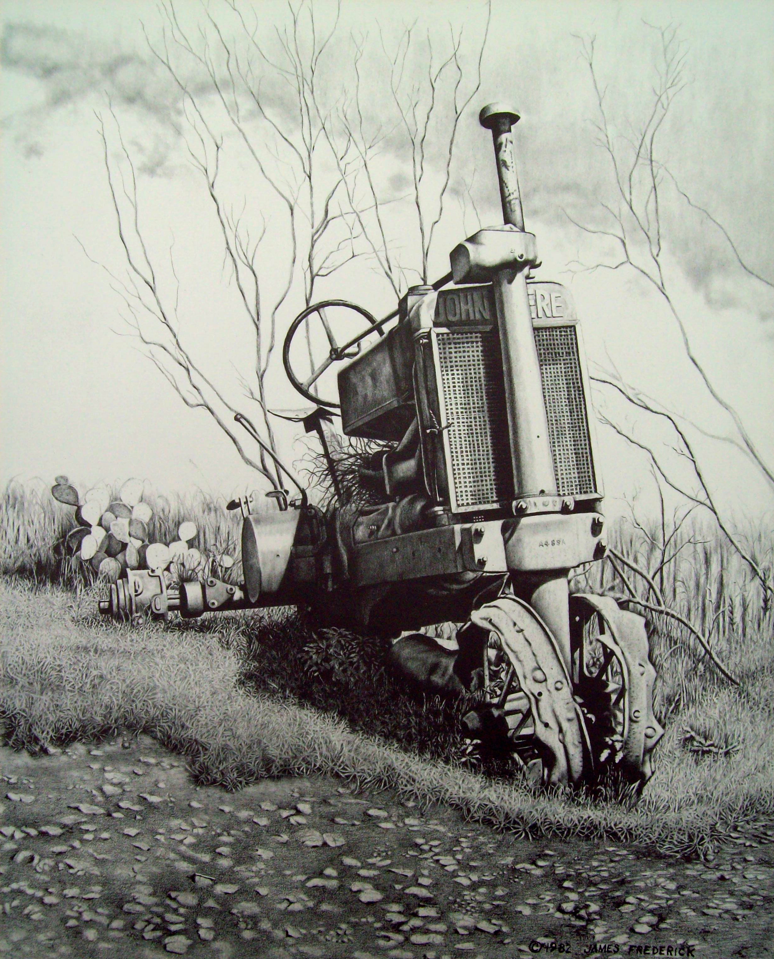
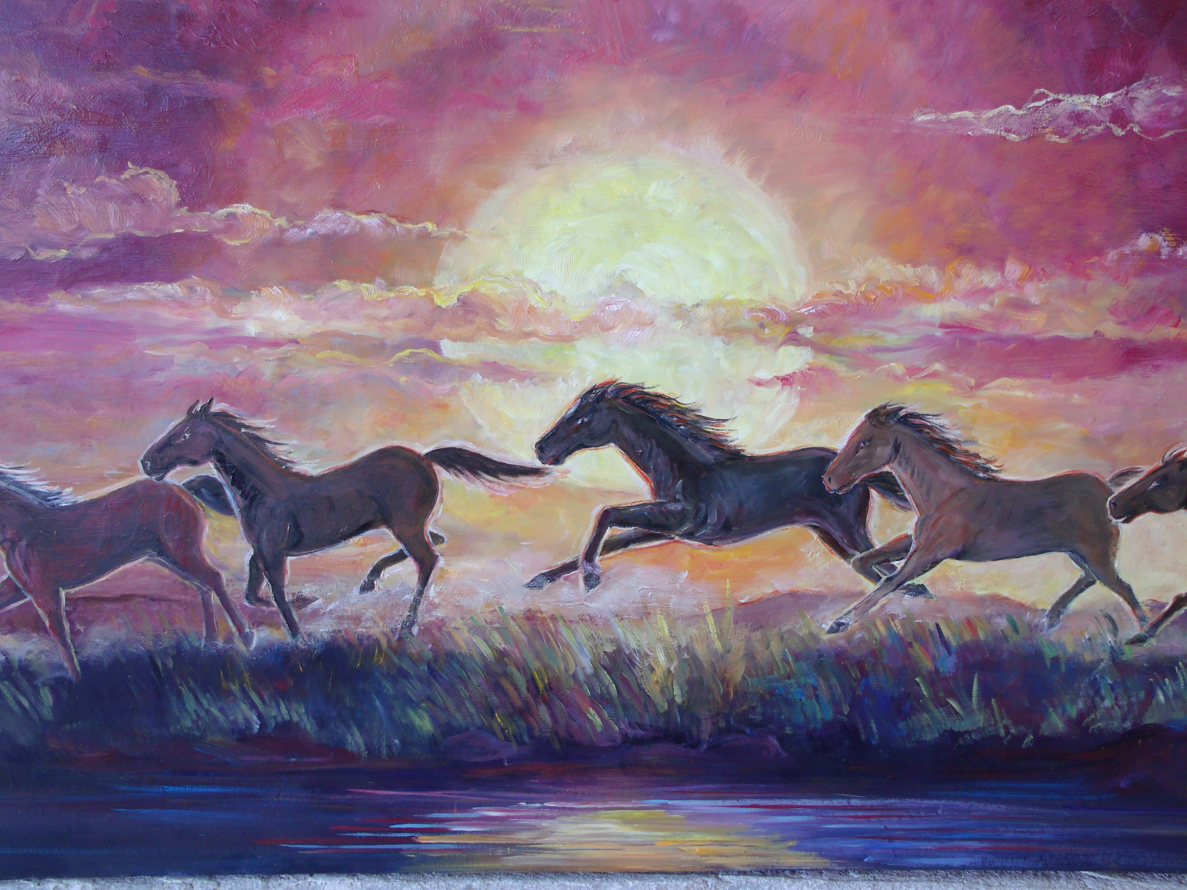
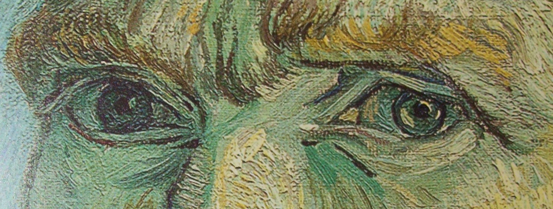
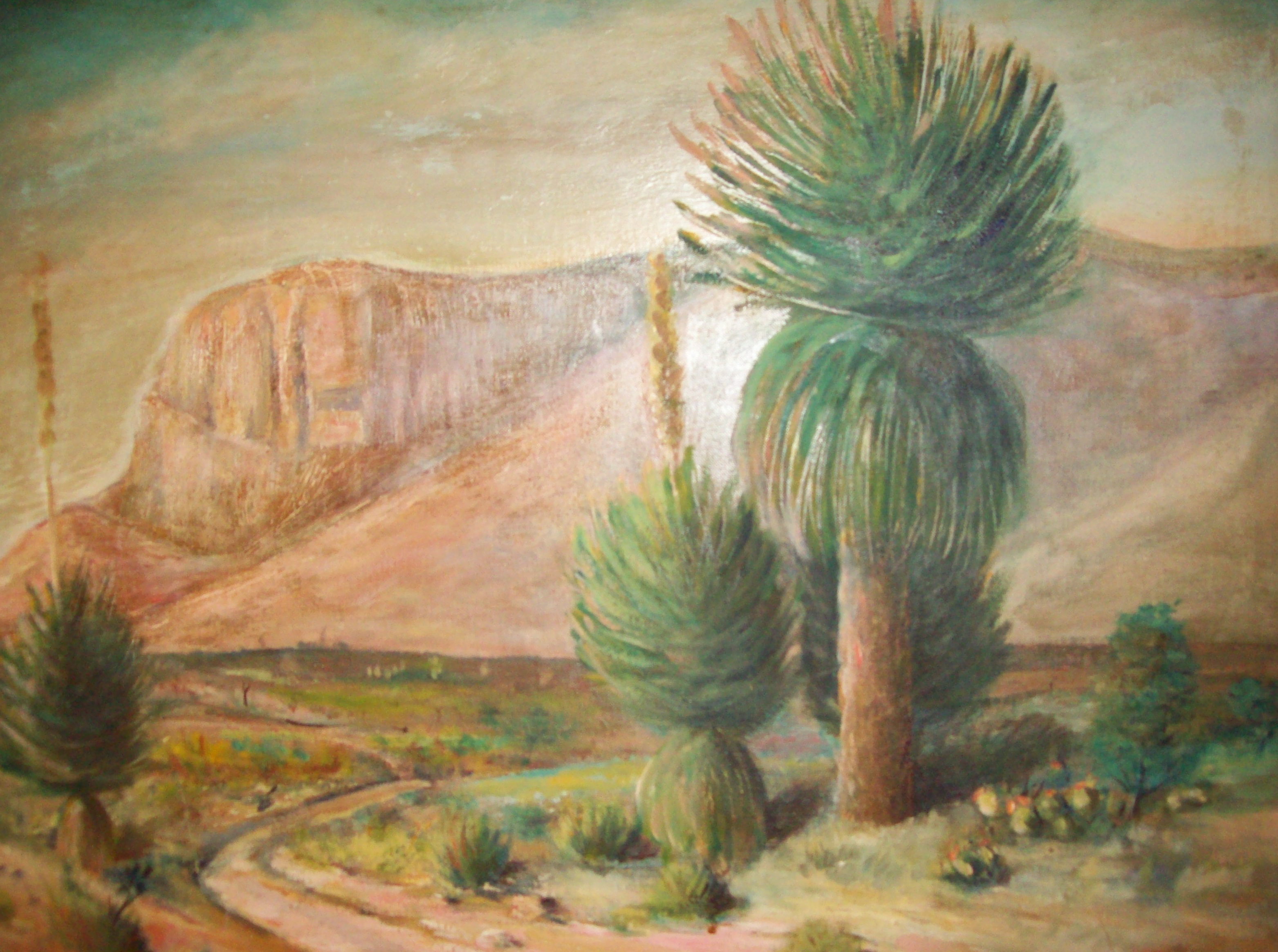
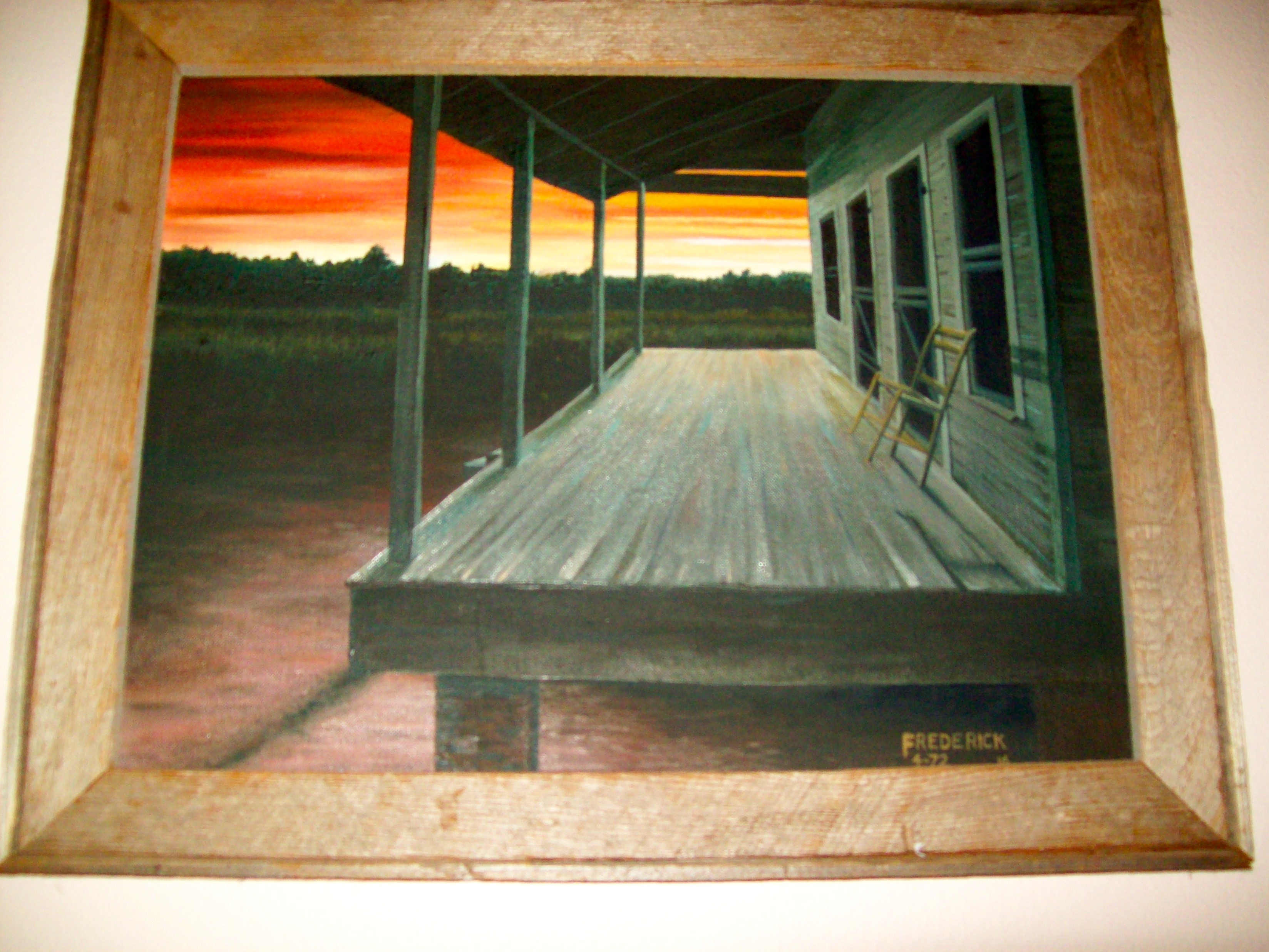
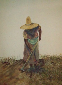
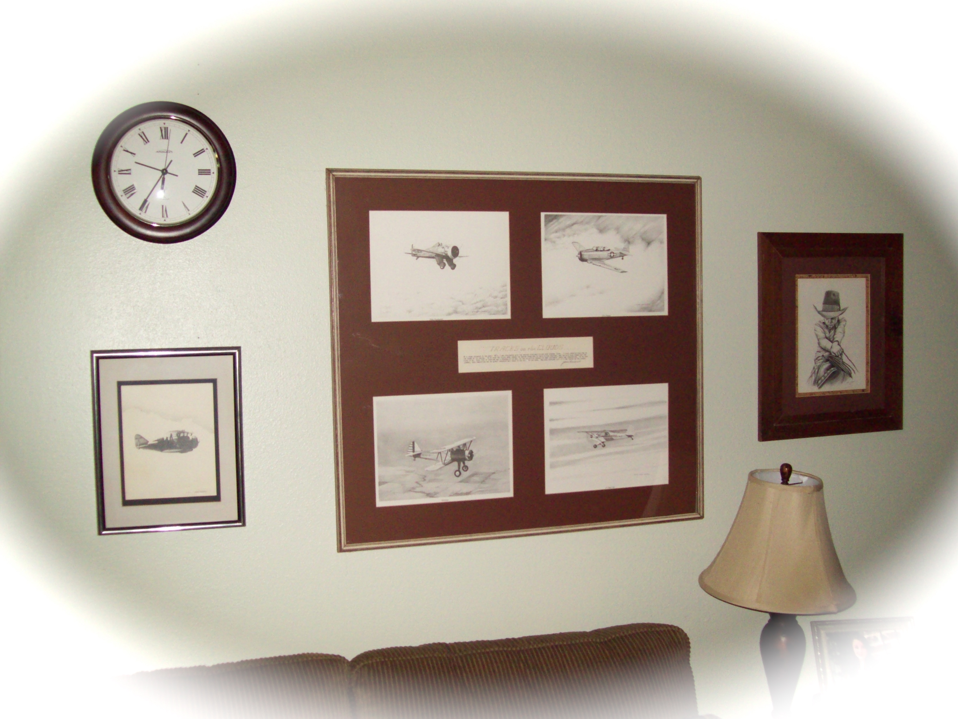
If no one else was concerned, then I shouldn’t be. Realizing this, I leisurely moseyed into the family room and snapped a shot of the bride’s other grandfather’s (the late James Frederick) artwork on the wall. While moseying, I decided to mosey upstairs to relax for a couple of hours before getting ready for the wedding.

To be continued: Please keep following, we will get the bride and groom to the preacher. And we’ll have a wedding party. Check back.

Art of James Frederick on the wall of the great house on the Frederick estate
Art of James Frederick on the wall of the great house at the Frederick estate

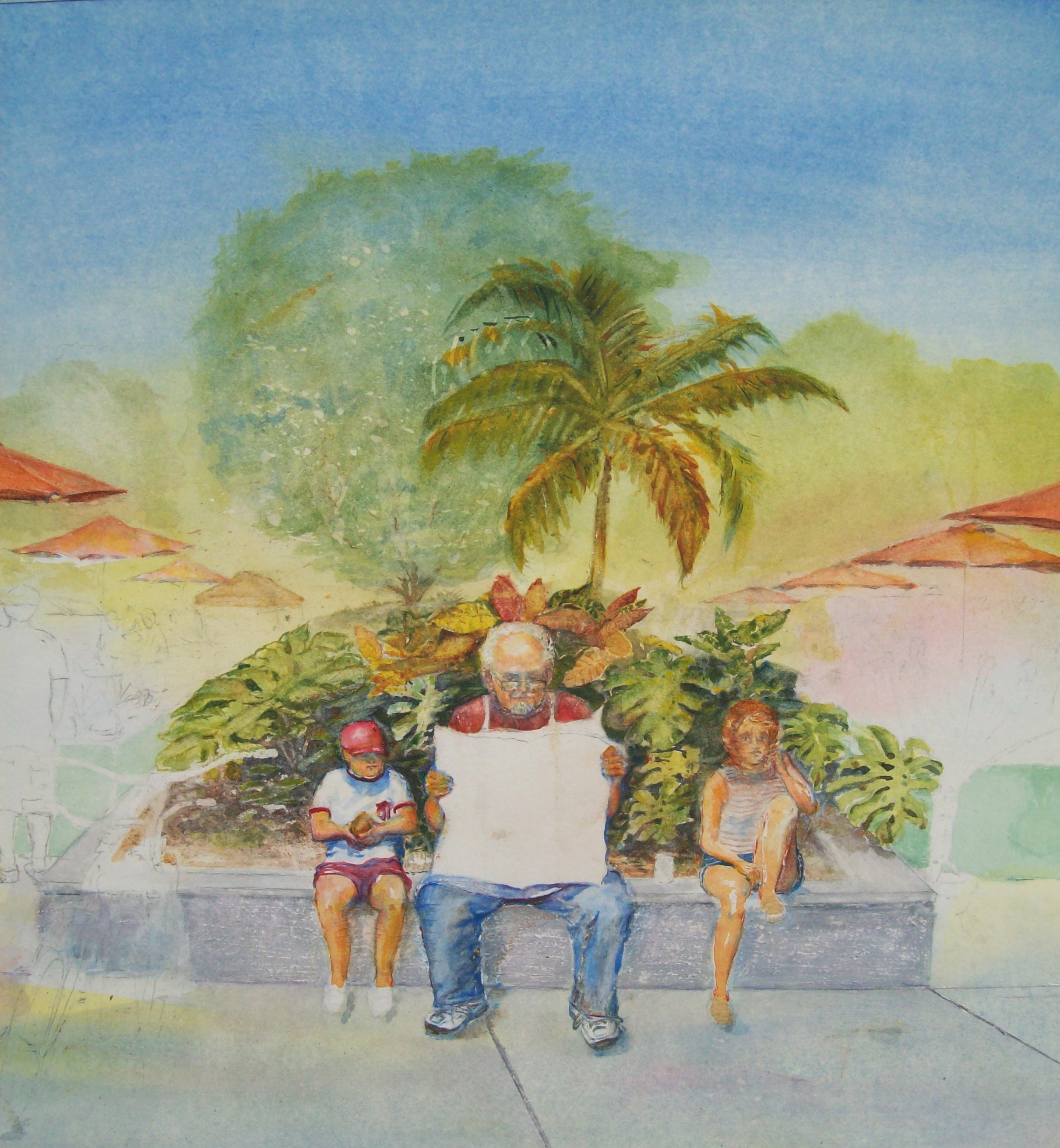
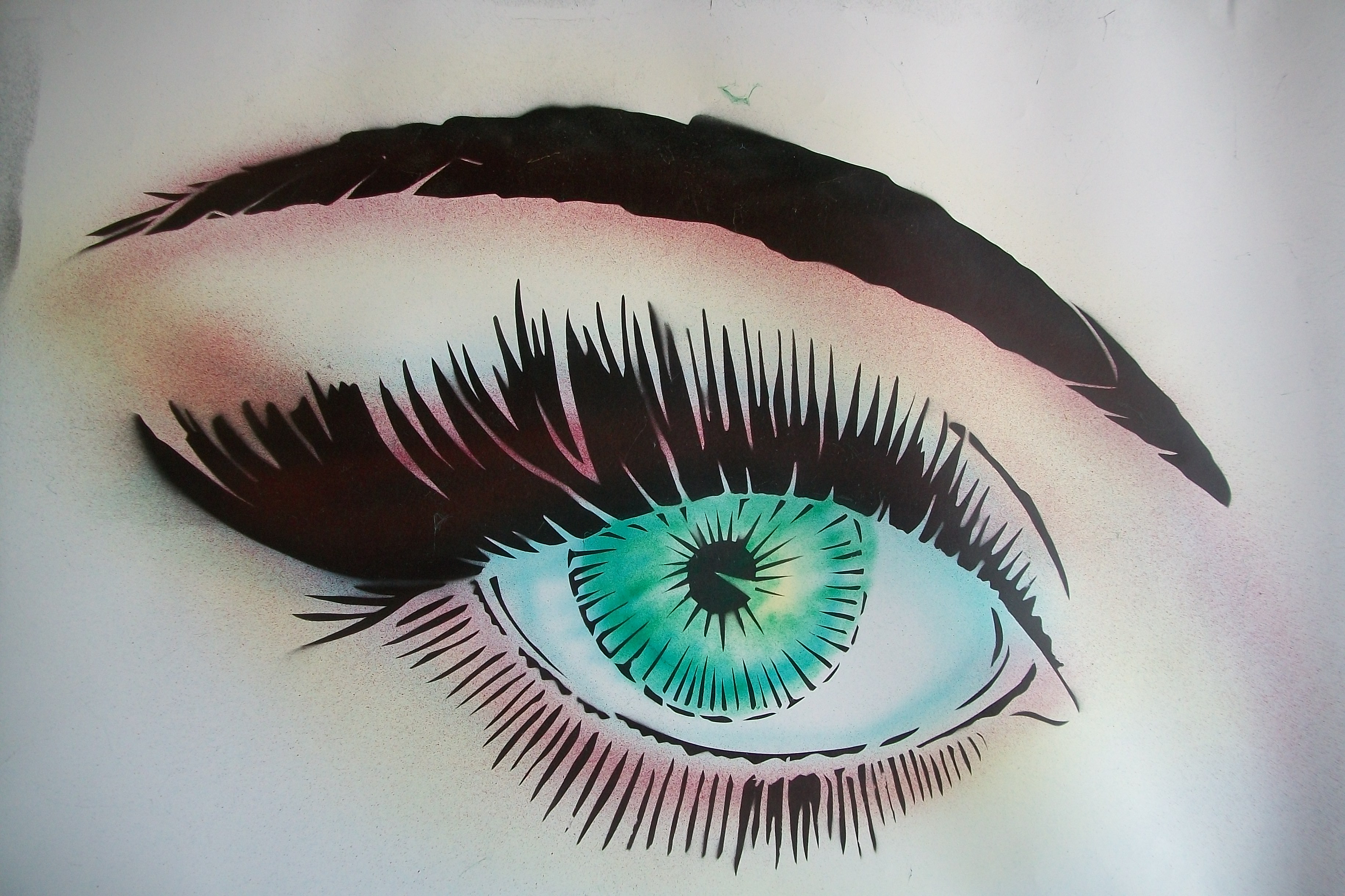
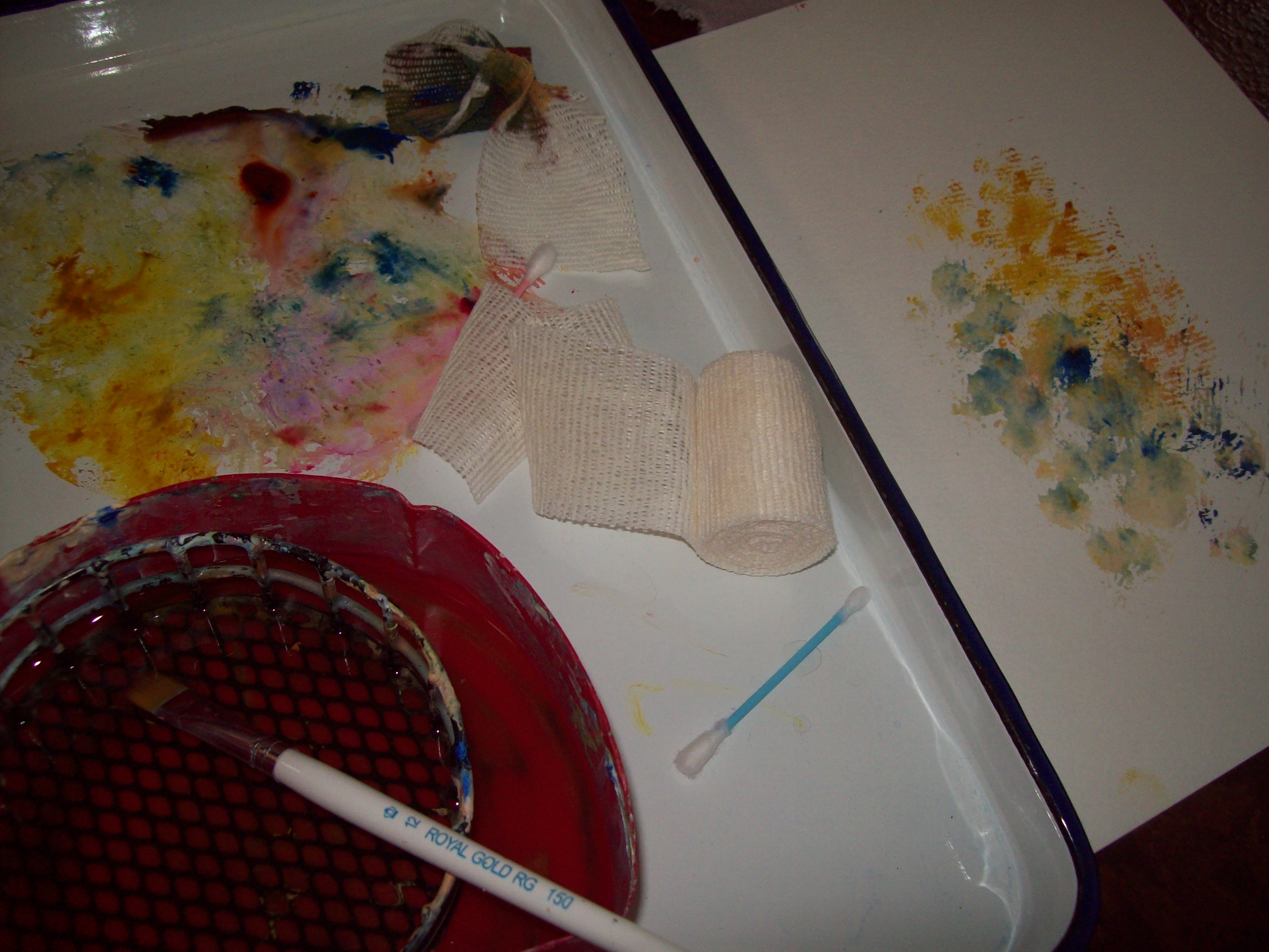
If you would like to see some of my grand-daughter Olivia’s (the bride) artwork, go to the top of page and click on Burton Family Gallery. You will have to scroll down through my work, one of my father’s painting, and then you will be in the talented Olivia area.

If you are over eighteen years old, sign up for the Art Center Information newsletter. There will be one person selected (soon) to receive a beautiful coffee table book. Splash 14.


Posted in art, art center information, red barn wedding, Wedding | Tagged , , , , , , | Comments Off on Red Barn Texas Wedding Part Deux

The Art of a Good Old Fashioned Red Barn Texas Wedding

Preparing the barn for the wedding

A few miles north of the oldest town in Texas where citizens blend southern hospitality with its original Spanish heritage to make it a uniquely “Texas town,” a wedding took place this past weekend at the Frederick estate.

All the guests considered it to be a good ole’ fashion red barn Texas wedding. Few, however, knew the extent of work that took place a few weeks and days before the wedding. This artist considers it to be a work of art, and although it was not done with paint brushes and substrate, it was still a work of art. The 10.55 acres estate was literally turned on its head in preparation for the wedding. We all wish Cody and Olivia the best as they venture into their new life together.

The marriage
“You may now kiss the bride.”

When the decision was made to have the wedding in the old barn on the estate, John (the father of the bride), decided it wouldn’t work unless a floor was installed. Up to this point, the barn had a dirt floor. So, the barn had to have a cement floor put in around the supporting beams. Then, came the landscaping.

“It just gave me an excuse to landscape the entire estate, which I wanted to do anyway,” stated John (my son-in-law~and son of artist, James Frederick).

The "Big" house
The “Big” house


Drive toward the two houses on the estate


Landscaping on the side of barn


Dropping off bails of hay~a little atmosphere


Stones laid for bridal path


One of the many beds landscaped


From hundreds of flowers and plants planted to stone laid surrounding the flower beds, including the stone path laid to the red barn, commonly now called the”bridal path.”

Landscapers working

Shot behind the barn to the back of the estate

I actually took over three hundred pictures for this wedding. My wife, Nancy, and I caught a plane and traveled all day Wednesday, and then drove two and a half hours to arrive late in the afternoon. Saturday was the day of the wedding, so I had plenty of time doing what I do, take lots of pictures, lay around watching a lot of workers work, give my advice (seldom taken), and overall enjoy myself.

We did take in a museum of the colorful town on Thursday, and my son-in-law, John, took Nancy and I on a colorful country ride on Friday, stopped by a Mexican restaurant for a lunch of chicken chopped cheese enchiladas and a chilled mango Margarita. We barely had time to take an afternoon nap, clean up, and show up at another Mexican Restaurant for the wedding recital dinner.

Nancy checking out the decorations in the barn.
Nancy (Olivia’s step-grandmother) checking out the decorations in the barn.
John, Father of Bride, bringing in supplies for the decorations


The landscaping, decorations, and planning were coming to their zenith. The work was near finished and it was time for the touches to the wedding preparations.


The mother of bride puts a table together
The mother of bride puts a table together.


The mother of the bride was getting very involved, not only from the kitchen, the drinks, set ups, the cake, the communications from the wedding planner, and more…even the dogs were involved.

The wedding dogs...
The wedding dogs…

The dogs gave up chasing squirrel, deer, antelope, wild boar, and any other creature they imagined roams the 10-1/2 acre estate in East Texas to help the adults with the wedding (if you believe that we all have problems!). We’re only trying to put on a wedding here, not jump into Storybook.

This was only the first chapter. Please follow the wedding of the century in the next blog: TO BE CONTINUED……


Be sure to sign up for our Newsletter (at tip right~18 and over).


Posted in art | Tagged , , | Comments Off on The Art of a Good Old Fashioned Red Barn Texas Wedding

Twenty-five Tips for Artist

Some time back, I came across a list of twenty-five tips for artists that I felt was helpful. I do not know exactly where I got the tips, but I will pass them on for your benefit.

Do I religiously follow the tips? Of course not. But I did tape the list to my art easel, hoping its presence will somehow soak into my artistic psyche, and make me a better artist.

R. D. Burton: Knobby Winter Tree: Graphite Drawing
  • Do value sketches.
  • Simplify your subject.
  • Do a fairly accurate drawing.
  • Think shapes, not objects.
  • Paint from large shapes to small shapes.
  • Pay attention to edges – hard, soft, and lost.
  • Be sure to have hard, soft, and lost edges in your painting.
  • Paint quickly, but under control.
  • Get in and get out.
  • Make your first stroke your best stroke. Remember,  fewer strokes win.
  • Use the largest brush you can for as long as you can.
  • Fewer palette colors result in fewer touches to the substrate.
  • When painting with watercolors, use a spray bottle to assist moving the color on the paper.
  • Paint on an angle to help keeping the color moving.
  • Tilt the board for even more movement.
  • Don’t worry about “messing up.” If you can’t correct or use your mistakes, turn the paper over and paint on the back.
  • Remove the stress by just playing. You don’t always have to create the “perfect painting.”
  • Use your brush to interpret, not render.
  • Stick to what attracted you to the subject in the first place. Down play everything else.
  • Be selective to where you place your level of attention.
  • Just let it happen, don’t try to “make” it happen.
  • Paint the same subject several times in a series.
  • Be smart. Understand that you will probably make more “bad” paintings before you start doing good paintings.
  • Paint! Paint! Paint!…and have fun.
James Frederick: "Poppin' Johny" Graphite on paper
James Frederick: “Poppin’ Johnny” Graphite on paper
Posted in art, art information, Art Tips, Artist | Tagged , , , , , | Comments Off on Twenty-five Tips for Artist

Controlling Artistic Freedom

Richard D. Burton: Watercolor in progress

For many realistic painters, there is a tendency to harness artistic freedom. They tend to feel lost when attempting to work freely with no drawing, no preparation, and only a vague idea of what kind of composition they’re after, what light source they will establish, and so forth. How will their design work? Should something be added or removed? These are just a few questions they anxiously ask, assuming the definition of freedom means no control, and no control means disaster. But without freedom, where is the fun?

How does one keep their freedom, and still take control of their painting? Taking control means answering all the questions of drawing, value, design, composition. In other words, determining all the elements of painting before beginning.

Lynn Burton: The Red Sunset" (oil on canvas)
Lynn Burton: The Red Sunset” (oil on canvas)

There is a way for a realistic artist to still have control of their work while keeping their total freedom, allowing them to retain their composition, drawing, and realism. Remember, chance will favor the prepared mind. The better we prepare before we begin our painting, the faster and more freely we can work.

We’ve all heard that a tight drawing makes for a tight painting. Is this really true? I tend to think not necessarily so. I find if I plan ahead, by the time paint is on canvas, board or paper, I can work outward, free and loose. The details are in the planning; therefore, there is little concern for losing realism.


Posted in art, art information, Artist, Uncategorized | Tagged , , | Comments Off on Controlling Artistic Freedom

Get Instant Success Using Vivid Colors

Lynn Burton: Sunflowers in Blue (oil on board)

Feel free and let go when applying color~R. D. Burton

You can bring almost any subject to life when using a wider vibrant range of colors than one would normally expect to see. Artwork that shows the use of a variation of colors, tones and values are the ones the average viewer remembers as worthy, and often great.

It’s easy to become comfortable with bright colors if you experiment with them. The best way this artist has found, is to always paint from a black and white photograph. Painting from a color photograph will hinder one from achieving a vivid, bright colorful look. Using black and white photos forces an artist to see only shapes and value changes in the composition. The world of vivid colors is in the imagination of the artist to experiment with. Try this on your next painting: select one object and paint it with most vibrant colors you can. Don’t paint it the way it looks, but make it come alive with exciting colors. Make sure the color changes as the values do; darker, lighter, warmer, cooler and brighter.

Wassily Kandinsky: Munich-Schwabing with the Church of St. Ursula (1908)

We can all take lessons from the great abstract artists of yesterday and today. Although I don’t paint in the abstract method, I have great respect for them because they have been a student of color. The good ones plan, and know just how one color affects the color placed next it. Their precisions seems mathematical, almost musical. This is especially present in some of the works of the original abstract artists; such as, that of Wassily Kandinsky in his painting: Munich-Schwabing with the Church of St. Ursula.

Creating contrast by keeping your darks dark and your lights light, or placing contrasting colors next to each other can also make for an exciting, vivid, colorful painting. Experimenting with, and learning to mix your own grays can make for a successful and vibrating painting. You can actually create super-darks that are far richer than neutral tube colors.

Hopefully, this article will inspire some of you to experiment and go deeper, higher, and open up your creativity to be free and let go!

Be sure to sign up for our ART Center Information newsletter (upper right hand corner). One of our members will be randomly selected to receive a copy of SPLASH 14. A beautiful book of selected contemporary water colors.51l4qbWWwoL._SL190_PIsitb-sticker-arrow-dp,TopRight,12,-18_SH30_OU01_AA190_

Also, feel free to post a comment (bottom of page). Make your comments decent (they are monitored). If you wish, also post a link to your art sight after comment.

Be sure to check out the Burton galleries at the top of page, as well as, some of the good opportunities.


Posted in art information, Artist, color, painting | Tagged , , , , | Comments Off on Get Instant Success Using Vivid Colors

The Introduction of Cubism to Western Art

Pablo Picasso: Portrait of Ambroise Vallard

I paint objects as I think them, not as I see them~Pablo Picasso

There seldom comes a time when the relationship of two people can make such an impact on the world as that of Pablo Picasso and Georges Braque did when they introduced Cubism to Western art. It created a revolution in the art world, becoming the dawn of Modern Art.

The two men met in Paris in 1907, immediately becoming good friends. They kept art at the heart of their relationship as they anxiously experimented together with new ideas, constantly taxing each others ability to go further in their quest to abandon conventional notions about form and space.

At the time, Picasso was interested in the art based on the angular figures from Iberian and African carvings. He was enamored by them, feeling they encouraged his artistic talents. Braque brought to the table a different perspective. His interest was in Paul Cezanne’s work, the way Cezanne used a technique in which he built up landscapes with blocks of color, challenging ideas on the connection of form and perspective.

Violin and Candestick
Georges Braque: Violin and Candlestick (1910)

Together, the two men threw out the principles governing Western art since the beginning of the Renaissance, replacing a fixed perspective with a multitude of viewpoints. In their works, there was no sense of distance, or to make figures appear solid. Very little modeling or shading was used. They restricted color and flattened space. Their technique was able to bring together in one painting many different aspects rearranged, creating a new vision of the original subject. It was as if they were depicting the world around us in a completely new way.

The movement became known as Cubism, taken from a comment made by the art critic Louis Vauxcelles when the first results of the collaboration were shown in 1908. He noted that all the elements in the paintings were reduced “to cubes” in his article. The rest is history.

Be sure to sign up for the Art Center Information newsletter. We are going to give away a copy of Splash 14 to one of our members.


Posted in art, art information, Cubism, Georges Braque, Pablo Picasso, Western art | Tagged , , , , , | Comments Off on The Introduction of Cubism to Western Art

Eyes Depicted by Artists

Mona Lisa
Mona Lisa

For hundreds of years, art lovers have admired and been mesmerized by the portrait of Mona Lisa. Without doubt, many people viewing the portrait of the mystic lady feel a connection, talking about the mood, the hidden history, and the over all feeling they get when gazing into the eyes of the woman. Most people don’t realize that the Mona Lisa is one of the first paintings which a woman is allowed to look directly into the eyes of the viewer. Perhaps, this was what made the painting so famous in the beginning, and the fame continued down through the centuries. I’m from the school that believes eyes depicted by artists in a portrait is what makes or breaks the portrait. Eyes by themselves can make great art.

Mona Lisa Eyes: Photographed segment of painting


Artist that concentrates on the eyes of the people they paint (whether portraits or scenes where people are included) can master the art of capturing the viewers attention. The eyes provide the primary focus, helping to define a relationship between the composition and the viewer.

Segment of drawing by R. D, Burton's Grand daughter~Olivia
Segment of drawing by R. D, Burton’s Grand daughter~Olivia

When studying the many self portraits of Vincent Van Gogh, one can’t help but see a disturbing history of pain and bewilderment seen in the eyes of the artist. It was as if over time he knew the path which he ultimately would travel, as if he was crying out for help, not understand why others did not see what he was seeing and feeling.

Vincent Van Gogh: Segment of self portrait


Probably, the most famous and recognizable eyes are those of Marylin Monroe depicted by the great pop artist, Andy Warhol, in his silkscreen. Many artists have painted the eyes of the great icon of celebrity who was admired by millions of fans. Secretly, I feel that out in the great world of artists, we have all tried to paint her eyes. Warhol, however, managed to capture a distant Marilyn, seemingly unfocused and detached. The photograph below does not properly depict the quality of the painting, but is used strictly for the educational benefit of this article.

Photograph of Andy Warhol's: Shot Red Marilyn
Photograph of Andy Warhol’s: Shot Red Marilyn

Below is a photograph of my brother, Lynn Burton, working in his studio on a series of airbrushed eyes.

Lynn Burton: Airbrushed eyes
Lynn Burton: Airbrushed Eyes

Be sure to sign up for our newsletter. One of our members will receive the beautiful art book, Splash 14.


Posted in Artist, Eyes, Mona Lisa | Tagged , , , , , , , , | Comments Off on Eyes Depicted by Artists

The Value of Color Schemes in Your Paintings

The Munsell Color Wheel
A version of the Munsell Color Wheel

So often as artists, we tend to feel we naturally know how to mix colors and use them in the scheme of our paintings. However, from time to time it is important to whip out the color wheels and check ourselves depending on what we wish to accomplish. For example, when trying to express ourselves in a harmonious painting, there are a variety of beautiful colors found on the triadic color wheel.

I have often found it necessary to refer to these different colors needed on the wheel.

Color Wheel
Basic Color Wheel
  1. Primary Color Scheme: Red, Yellow, and Blue. You can use primaries to neutralize a color or side by side to make a statement.
  2. Secondary Color Scheme: Orange, Green, and Violate. These adapt well with landscapes. In your different color scheme use, allow one color to be dominant. With green and oranges, you can see how this would be perfect for your nature scenes.
  3. Tertiary Color Scheme: (1) Yellow-Green, Blue-Violet, and Red-Orange, or (2) Yellow-Orange, Red-Violet, and Blue-Green. As with the other color schemes, one of the colors should be dominant.


Below is a painting my father painted many years ago of Signal Peak (a mountain in New Mexico). I especially like the colors he used in his landscape composition.

Arlen Burton: "Signal Peak" (Oil on Canvas)
Arlen Burton: “Signal Peak” (Oil on Canvas)
Posted in art, Artist, color, color schemes, painting | Tagged , , , , | Comments Off on The Value of Color Schemes in Your Paintings

Artists are Special People

Lynn Burton: Air brushed eye

Have you ever noticed a shimmering off the curvature of a drop of dew on a leaf in the early morning sunlight?  Did you stop in awe to concentrate on it?  Did it change hues as you moved about?  Were you fascinated by it?  If so, chances are, you are an artist.  Artists are special people and have something unique.  They have what I like to call a third eye!  An artist’s eye can split light like a prism!

No matter what an artist sees in nature, from the moment they start placing pigment to canvas, board, paper, or whatever surface they use, the finished work will always belong to no one but them (even if it is sold to another, their name is on the work). This knowledge helps an artist create the discerning eye.

James Frederick :The Empty Chair (Oil on Board)
James Frederick :The Empty Chair (Oil on Board

Since I do most of my work in a studio, I use both photography and color sketches from nature.  When I see a sky that has a certain blue, yellow, gray, pink, or white hue, I try to match it and make swatches of color on a 3X5 index card with notes on the back describing the weather condition, the time of day, and any other thing that creates the mood of the painting.  I usually can find a use for the card another day for another painting.

An artist has an artistic license to come up with whatever composition they wish, with colors real or not working together in their imagination. That is why they are called artists~they see the world differently…they are special.

Be sure to enter to receive our newsletter and get your name in to be one of the lucky ones that receives a copy of the beautiful art book – Splash 14.


Posted in art, Artist, painting | Tagged , , , , | Comments Off on Artists are Special People

Using Gauze to Create Texture in Your Watercolors

Studio Photo #1244
Studio Photo #1244

Every watercolor artist experiments with different techniques and tools to gain knowledge to produce successful texture in their paintings.

Transparent watercolors do not create natural texture as many other mediums do. Therefore, it is necessary for a successful water colorist to learn different methods that can replicate texture to make paintings successful.

A certain tool that I found fascinating in creating technique is cotton gauze. I discovered this over thirty years ago when I painted Woman in the Field.

Richard D.Burton: "Woman In The Field" (watercolor)
Richard D.Burton: “Woman In The Field” (watercolor)

I still use this technique to this day. I find that I can create interesting foreground effects (as in the picture), as well as, interesting background techniques. Often, I will cut small pieces with scissors to use in selected areas such as a knitted white curtain faintly seen through a reflected window from the outside on a bright sunny day.

Try shredding or stretching gauze and you can get unusual and appealing texture. You can vary the texture by moving the gauze around and reshaping it. Try experimenting with this in every way you can imagine. Take an entire day and play with it…be creative!

Tip: Lift the entire painting and allow different colors to run together after applying colors next to each other  on wet paper and gauze.

What you will discover when experimenting is that the gauze will stick to the paper when applying a clean mist of water with a spray bottle. You will need to find what works best for you, however, I suggest you use thick fluid colors when using gauze. The effect will be much more pleasing. After the paint dries, gently lift the gauze from the paper. I’ll predict you will be pleasantly surprised with the results.

When using gauze or any other “tool” to create technique, keep in mind to use masking fluid (or whatever you use) to block off the segment of your composition you wish to protect to keep paint from accidentally landing on them in the process.

Be sure to sign up for our Art Center Information Newsletter (upper right of page). You may win a copy of SPLASH 14. ONE COPY TO BE GIVEN AWAY TO ONE OF OUR MEMBERS.


Posted in art, art information, Gauze, painting, Texture, watercolor | Tagged , , , , , , , | Comments Off on Using Gauze to Create Texture in Your Watercolors