Experimenting With Different Drawing Styles

Richard D. Burton: Graphite drawing of female

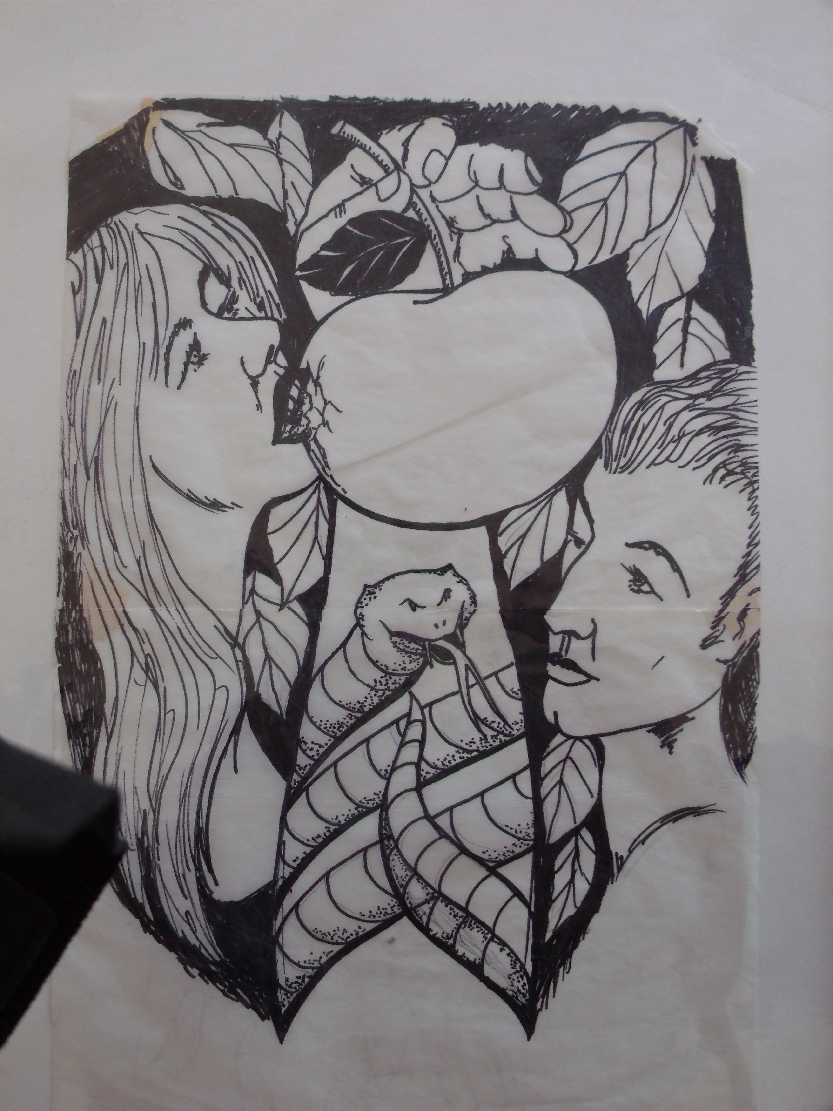
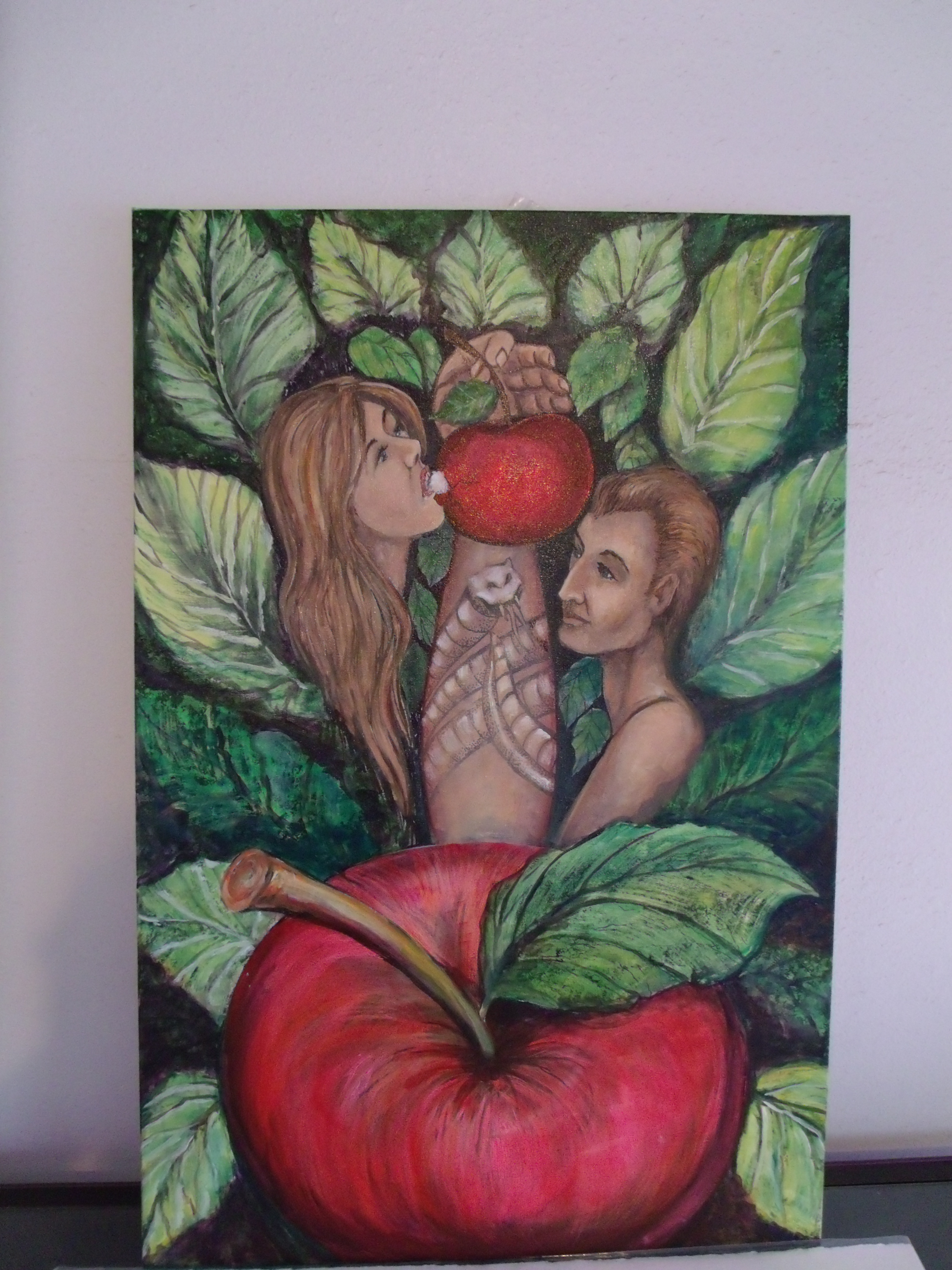
When selecting certain drawing styles, you can use several pencil choices in as many ways as a painter uses a brush. For example, a lively linear approach allows every pencil stroke to show. If you wish to have a smooth photographic effect, blend your strokes. However, you may want to experiment with dots, short strokes, straight or curved. When you do this, a whole new world of discovery will appear on your paper with excitement. Although, I personally draw with all of the styles mentioned above, my preference is a smooth blending to capture a more photographic effect. Yet, this all depends on the subject.

Study for Grinding Gears of Time

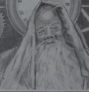
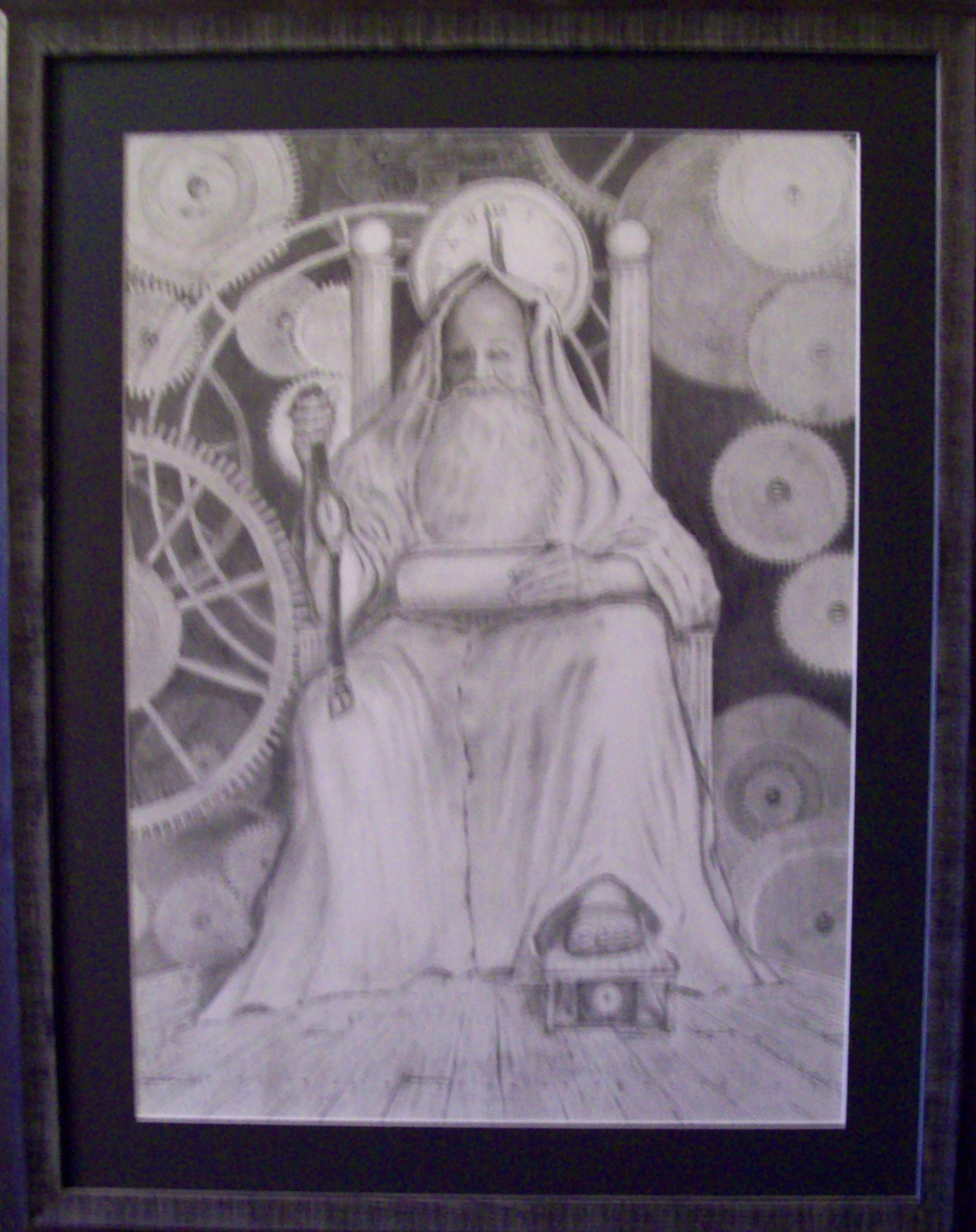
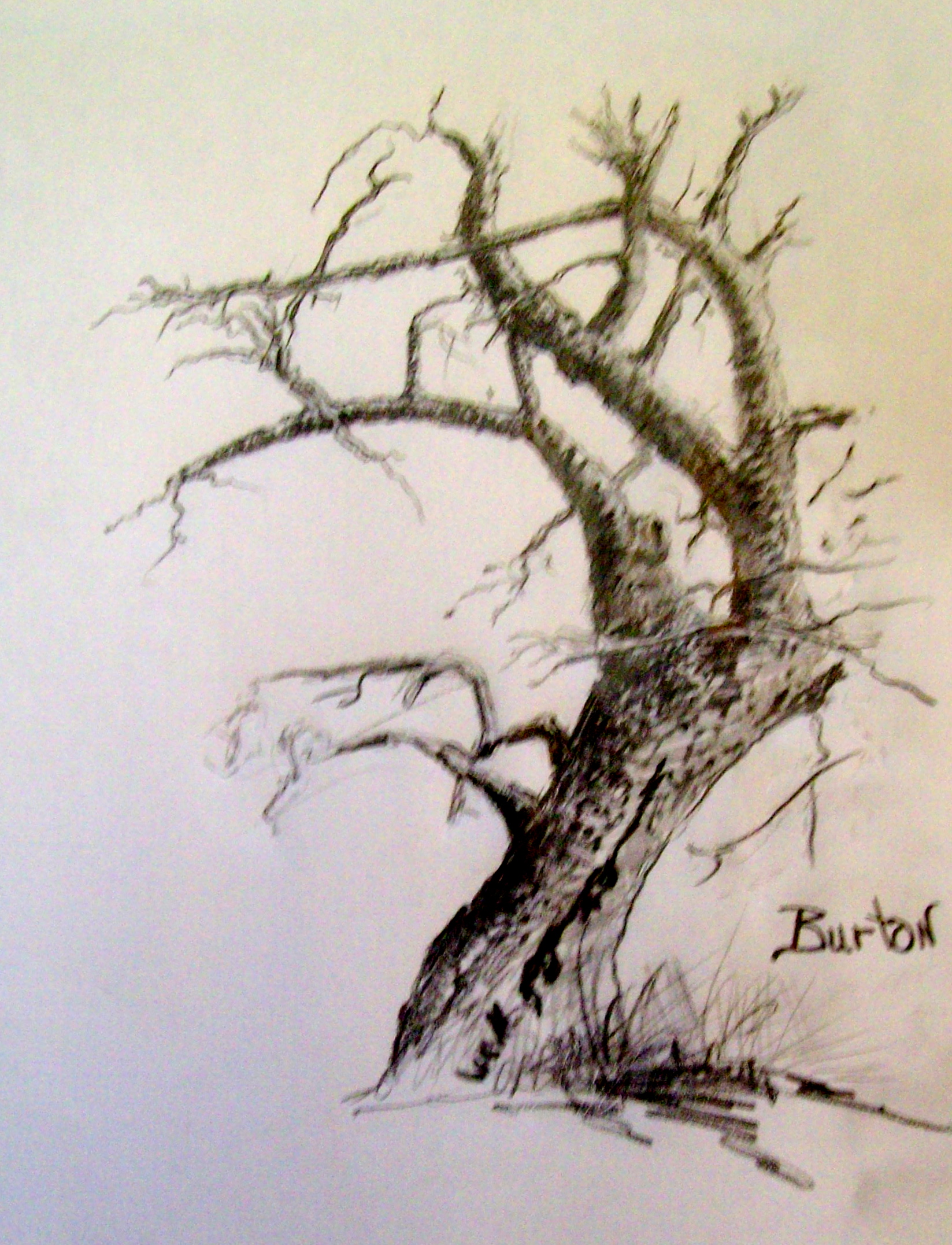
The study to the right was a first draft of my drawing, Grinding Gears of Time. It is done in a careful blending style in an effort to get the “photographic” effect. It is a study for the finished drawing. The subject is Father Time, of which I have made many different sketches and drawings over the years. Below is a study for the same subject that I did more than forty years ago. Here, the style of drawing strokes used was more bold strokes.

Richard D. Burton: Segment of drawing, "Father Time" (1970)
Richard D. Burton: Segment of drawing, “Father Time” (1970)


Values are very important when drawing black and white pictures. It helps any pencil artist to work them out ahead of time. It doesn’t matter whether done loosely as a simple sketch, or ones with more detail as those demonstrated on this page. My personal preference is to take value sketches to a more completed work to get a better “feel” for the final drawing.

Art Tip: When considering values, it helps to start with the light-to-middle values. Keep in mind, once you’ve laid down the darkest stroke, it’s very difficult to lighten or clean it up with an erasure.

Art Tip: With pencil drawings, you have several choices of leads which vary between hard, medium and soft. The way you create your point can make many effects and textures. Experiment with this as you are stroking, cross-hatching, dotting and making marks on the paper.

Be sure to sign up for our newsletter. One of our members will receive a beautiful art book…SPLASH – 14. Good luck. (Above Right)

Grinding Gears of Time
Richard D. Burton: Grinding Gears of Time
Posted in art, art information, Artist, drawing | Tagged , , , , , , , , | Comments Off on Experimenting With Different Drawing Styles

Artist For More Than Half a Century and Still Going Strong

Artist, Lynn Burton, working on airbrush painting.

“I never saw a good artist I could not steal from.”~Pablo Picasso

“I never steal another artists work. I just take it to my level.”~Lynn Burton

I recall as a young teenager (fifty-five years ago!) watching my artist brother, Lynn Burton, flaming and pin-striping other teenagers cars. He was so popular that he was seldom out of cars to work upon. It also gave him a stream of income. However, I wasn’t aware until recently that he still does this type of work for a “hot-rod” club in his hometown.

Lynn Burton: Air brushed eye

Lynn is not only a sign painter, owning his own sign company for a more than a half century, but is also a fine artist with works sold all over Texas. He also has several famous wall murals in restaurants, clubs, and malls throughout Texas and Oklahoma.

“When I was a teenager, I was a fan of ‘Big Daddy Roth’s’ hot rod magazine. Every teenager that had a car knew who artist, ‘Big Daddy Roth’ was. I couldn’t wait to get the next issue of his magazine, knowing that someone would show up with a car wanting some ‘flaming’ or ‘pin-striping’ done. They’d always have a copy of the latest issue of ‘Big Daddy’s’ most recent art, and I wanted to be on top of it. I learned to make every curve and color that the ‘master’ did. Fortunately for me, years later I had a chance to meet the man and had a good conversation with him. I let him know that I was one of his biggest fans,” Lynn said when recently talking about it.

Recent Pin Striping Job for Hot Rod Club

To the left is the block out work needed to pin stripe a car for a recent job that he did for a hot rod club.

Lynn said: “There’s a lot of ways for an artist to make money. If they have the talent they can always figure it out for themselves. I know if I stay busy, there is always someone else that wants my time with a new project. The secret is to always be painting something. It doesn’t always work out, but you always gain. I never fail to have something positive about anything I do…even if it’s learning something new by making mistakes. It’s all positive.

Completed work
Completed work

We wish everyone a HAPPY NEW YEAR, and may 2014 be your greatest yet!

If you are not already a member of Art Center Information’s  newsletter, please join. (Upper Right)


Posted in art, art information, Flaming, Lynn Burton, Pin-stripe | Tagged , , , , , , | Comments Off on Artist For More Than Half a Century and Still Going Strong

Thanksgiving and the American Dream

Freedom from Want...Artist: Norman Rockwell
Norman Rockwell’s famous painting: Freedom from Want~Placed here for information only

In the fall of 1621, the Pilgrims of the Plymouth Colony shared the first Thanksgiving with the Wampanoag tribe of Indians.

There are few of us that were taught correctly about the landing of the Mayflower, the settlement of the Plymouth Colony, and the first Thanksgiving when we were in elementary school, middle school, and high school. Why? Perhaps those that wrote history books didn’t find it necessary. Perhaps, the story was better than the facts. Who knows? But did you know that the lessons learned from the Indians is what created the American Dream?

I do believe the one thing we’ve all come away with is that if it were not for the original Americans, we never would have made it to this day. Fortunately, the settlers of the Plymouth Colony were smart enough to not be stupid when they had an opportunity to receive help and learn from the Indians. Their stupidity diminished as they starved. It was a good day when the Pilgrims concluded a peace treaty with chief Massosoit of the Wampanoag tribe.

Lynn Burton: Indian Chief: Oil on Canvas

Where the original Pilgrims landed was far off their original course. They landed and settled in an empty Indian village where all the inhabitants had been wiped out by disease. The religious leaders concluded this was done purposely by God. To them it was a certain sign they should settle in the place.

The original plan was for the colony to be run in a communal form of government. This idea was growing popular in some of the religious circles back in England, but was more talk and economic philosophy than experimenting. In Plymouth, they tried the experiment to devastating results. It was here where the term “freeloader” began.

The Pilgrims set aside a common area of land for each member to plant their fair share of crops. The harvest went into a communal sharing and each got their equal share. The problem with this plan was that there were those that didn’t bother to do their fair share of planting and harvesting. However, they demanded an equal share when the crops were doled out. After all, it was communal living…right? It was only the right thing to do that they got their fair share…right? The settlement was in a near state of starving because of the “freeloaders”.

Lynn Burton: American Indians (Oil on Canvas)

Fortunately, the Wampanoag tribe swept in to help the starving Pilgrims. They shared their food, saving the settlers from certain death. They  provided critical instruction on adapting to their environ, especially in cultivation of crops. Although, the tribe lived in a form of communal style, each of the tribe members were given their own personal sections to plant crops, and could only take from their own harvest.

After this, the colony governor, William Bradford, took from the lesson learned from the Wampanoag and gave tract ownership to each of the settlers. Henceforth, each provided their own harvest, hunting, and fishing ever after. Those that did not or could not hunt or fish bartered time working crops for those that did, and vice versa. Thus began the freedom of bartering time, effort, and talent for the needs of the individual. Happy Thanksgiving! God Bless America.

We wish to thank the Original Americans for their historic help.

James Frederick: "Original American" Graphite on Paper
James Frederick: “Original American” Graphite on Paper


Posted in American Dream, Indians, original Americans, Pilgrim, Thanksgiving, Wampanoag Indians | Tagged , , , , , , | Comments Off on Thanksgiving and the American Dream

Art Tip: Think in Terms of Shapes and Value Masses

James Fredrick: Plate, Fruit, and Coffee Pot

If you eliminate all details and color in your future painting, you can see how the composition is expressed as three value masses — black or darkest, mid-range (gray), and light or white. This works especially well when considering landscape painting.

Although you may paint your shapes with color instead of black and white, stick with the idea of dark colors to light colors for the three value masses. Decide on your major light and dark shapes and don’t deviate from them. If painting your landscape plein air you will not be able to change the shadow shapes as they move with the sun, but if you swiftly define your value shapes in the beginning, you will have reference where the shadow and the light join.

Lynn Burton: Oil on Canvas

It’s often hard for many artists to think in value masses instead of subjects. Most all paintings have a subject. However, if the subject matter has more emphasis than the overall painting, it will lack excitement by being buried into too much detail. Let your shapes and value ranges carry the subject.

Think of the many beautiful black and white photographs you’ve seen that were  taken before the invention of color print. The great photographers of the time were masters at understanding the value of abstract shapes and the use of light. Watch an old black and white movie and you’ll feel the emotion created by camera. Often, I sit in front of the television watching old movies with a camera in hand for the express purpose of capturing the true art of the camera people of the times. My file of photographs have more black and white in them than colored.

Lynn Burton: Black and White sketch-"Adam and Eve"
Lynn Burton: Black and White sketch-“Adam and Eve”
Lynn Burton: "Adam and Eve" - oil on board
Lynn Burton: “Adam and Eve” oil on board

A good exercise to help concentrate on interesting value shapes is to paint the entire picture in black, gray, and white. Concentrate on this, you will see interesting shapes that can liven up your artistic fervor, and it soon will become second nature.

Be sure to join ART CENTER INFORMATION’S mailing list. A beautiful art book will be given away to one of our entrants. See the notice above right to join.

Posted in Abstract Shapes, art, Value Masses | Tagged , , , , , | Comments Off on Art Tip: Think in Terms of Shapes and Value Masses

Art Tip: Mixing Watercolors

Munsell System: Shown here only for educational purposes

When considering mixing colors using watercolor, there art two different methods to use: (1) mix them in a mixing tray, and (2) use a layering up method by applying one color on top of the other on the paper. When using the layering up method, be sure to let the under-painting to totally dry; otherwise the effect will be disastrous. Also, use transparent watercolor for the top coat.

Remember, if you mix two primary colors, it produces a secondary color, and if you mix three primary colors, it produces a tertiary color. Creating useful highlights are done using the actual paper surface.


No matter the method chosen to work, take the time to try out the color by creating color swatches of the mixture on separate piece of paper of the exact quality intended for use on the painting selected.

Sample of water color mixture

In the unfinished watercolor to the right, both techniques were used. To get the overall flow of the colors, a mixture of pure colors with a fully watered paper were used as an under-painting. This was intended to give the full painting a harmonious effect. The actual painting is mostly using the second method of layering color on top of color.

The best advise for a wannabe artist is to experiment and come up with the best techniques that work for them. Most all watercolorists use a good combination of both techniques. For example, only until the rest of the painting (at the right) is more complete will there be more layering up of colors to make it more harmonious, even if this means “lightning up” the colors if they are too bold.

Be sure to join Art Center Information’s newsletter at the upper right side of the page.51l4qbWWwoL._SL190_PIsitb-sticker-arrow-dp,TopRight,12,-18_SH30_OU01_AA190_ You will automatically be entered into a selection to win a beautiful art book: Splash 14

Check out the galleries at the top of the page. Also, peruse the Great Opportunities sight.


Posted in art, Mixing Watercolor, painting, watercolor | Tagged , , , , , | Comments Off on Art Tip: Mixing Watercolors

Experimenting With Color

Lynn Burton: Sunflowers in Blue (oil on board)

“There are just so many notes in music and just so many colors, but it’s the beautiful combination that makes the masterpiece.”~Charles Hawthorne

Exercise 1: I like to think of a color wheel to not be a wheel at all, but, instead, a color cylinder with a ten gray scale of each color from the darkest hue of each color at the bottom to the lightest hue at the top. The true color would be in the middle. This is very simple exercise for an artist to accomplish. All it takes is some time and paint, but it is another helpful tool to have around the studio.


James Frederick :The Empty Chair (Oil on Board)

But to make the masterpiece that Charles Webster Hawthorne (founder of the Cape Cod School of Arts – 1899) referred in his quote, it takes a lot more than the simple color cylinder above. The cylinder as created has value, but it does not define the neutral grays of each of the colors as they are used next to another color; so our experiment must expand. This experiment will not solve all the problems an artist faces when trying to stay within a color range, but, again, it is a good tool to have in the studio.

Exercise 2: Create a color cylinder with two colors opposite one another on the color wheel. Mix them around the cylinder in ten hues toward middle gray. Start this in the middle of the cylinder and work hues up and down, creating a gray scale (up 5 shades lighter toward the top — 5 shades darker to the bottom).

The exercises above are not necessary to be a good artist. However, they are very helpful in understanding the three qualities of color: Hue, value, and intensity. There are many great charts and systems creating the colors needed to paint. Many artists prefer a simple color wheel to mix their mixtures on sight. Usually, these artists have already studied color, color wheels, and mixtures, and confidently know what they are doing. A good number of artists use more complicated color wheels and studies, such as the Munsell system (below).

Munsell System
Munsell System


Use of the depiction of the Munsell Color System (left) is for education and information only, as it relates to this article.

Be sure to sign up for the ART CENTER INFORMATION newsletter (above right).


Posted in art, art information, Artist, color, Color Experiment, Color Wheel, James Frederick, Lynn Burton, Munsell Color System, painting | Tagged , , , , , , , | Comments Off on Experimenting With Color

An Artist’s Path to Simplicity is Wrought With Complications

Richard D.Burton
Richard D.Burton

407714_167519530020980_100002888033327_230292_1520329184_n-1An artist’s path to simplicity is often wrought with complications. The more I try to think of an interesting and simple composition, the more it trends toward a complicated one. Usually, these become quick sketches set aside to become a “to do” on my bucket list. Ah, I so desire the good old days when I could paint more simple compositions.

However, most artists try their best to draw or paint something that has never been depicted by another artist. This often leads to complicated compositions. For example, I have one of these on my bucket list. Sincerely, I doubt if I’ll ever get around to drawing it, because this one is almost too much of a challenge. Originally, it was planned to be a finished graphite drawing the same size as The Grinding Gears of Time (18″x22″).

Richard D. Burton: "Grinding Gears of Time" Graphite on Paper
Richard D. Burton: “Grinding Gears of Time” Graphite on Paper

The composition in mind would be a self portrait of me sitting at a table working on a puzzle. The picture would be straight on where I was on the opposite side of the table, and the puzzle (obviously) was lying flat on the table with the top of the puzzle toward the viewer. The picture depicted on the puzzle was exactly the composition the viewer was seeing. In other words it would be a self-portrait of me putting a puzzle together which was a self-portrait of me putting a puzzle together.

In the composition, I would be finishing the puzzle by reaching out to place the last piece to it. This piece would be a portion of the right eye…the portion that showed the pupil. I would be reaching forward with the piece in my hand angling it so the pupil would be staring straight at the viewer.

It’s not that this composition is complicated enough, but upon further consideration, I realized it was even much more complicated. For, what was the depiction of the “me” in the puzzle doing? He was putting a puzzle of “me” putting a puzzle together, which meant it would stretch into ad infinitum — over and over.

Since the top of the puzzle is toward the viewer, there is perspective involved. Realize, the bottom of the puzzle is near the body of the figure. In other words the top of the puzzle (near the viewer) is slightly wider than the bottom. Not only this, think of the complications of foreshortening. My arm and hand will stretch toward the viewer with the last piece of the puzzle. It also stretches toward “me” in the picture depicted in the puzzle…ad infinitum.

Richard D. Burton: Winter Tree


See why this composition is on my bucket list? I will do it, but what a challenge! I think I’ll go back to drawing trees with no leaves. How do they say it? Keep it simple…stupid.

Be sure to become a member of the Art Center Information Newsletter (above right). You may be the lucky recipient of a beautiful art book.


Posted in art, art information, Artist, Complicated, Composition, Simple | Tagged , , , , , , | Comments Off on An Artist’s Path to Simplicity is Wrought With Complications

Question For Artists: Why is it So Hard to be Simple?

100_1167-300x207Here is a good question for artists: why is it so hard to be simple, and not complicated? I’ve found the more I’ve aged, the more complicated I’ve become. It’s just the way it is. Is it because I desire to be an artist that now wishes to make a statement? I have no  idea.

The picture to the left, painted in the 1980s (yeah, that’s in the last century), would be considered (at least by me) simple. In it’s simplicity, it’s beautiful. So why am I so complicated now? At this point in my career, I should be slapping paint on canvas, not having a care in the world, and just having fun. But, instead, I’m concentrating on much more complicated compositions. Somehow, I thought it would work the other way, but it doesn’t.

Lately, I’ve had this muse. It’s too complicated to explain on this blog post. I’ll make it the entire next blog post, but it’s really bugging me. Forgive me for using old last century language, but it really is BUGGING ME! I can’t get it out of my mind. (The next Blog Post — don’t miss it.)

Father Time
Father Time

Take for example of the graphite drawing of Father Time at the right.. It is simple and  in its own way, interesting. Sadly, it is not one of my original compositions, even if every stroke of the graphite pencil is my own. The original composition is from the artist, Andrew Loomis.

In my early days, I copied a lot of artists. This is the only way I could learn to create as a self taught artist. I loved the simplistic style, the stroke of every pencil point upon the paper. To me, it was beautiful. However, I constantly thought about making a picture of my own composition of Father Time. So, could I do something simple?…evidently, not.

Grinding Gears of Time
Richard D. Burton: Grinding Gears of Time

In a much more complicated manner, my most recent drawing of “Father Time” is on the left. I call this painting The Grinding Gears of Time featuring clock gears in the background. Which picture is the best? For me, the one on the left, because it’s my own composition. But in all fairness, the copy of the Loomis is much less complicated, and is beautiful.

Please check out the galleries above, the Burton Gallery, which shows my artwork, my grand daughter’s artwork, and one of my father’s famous paintings. Also, visit Lynn Burton’s Gallery (my brother). Check out the Great Opportunity sight for good sights suggested for artists. I could use some “likes” on my Facebook page at the right.51l4qbWWwoL._SL190_PIsitb-sticker-arrow-dp,TopRight,12,-18_SH30_OU01_AA190_


Be sure to enter the newsletter, and take a  chance on winning a beautiful free art book, Splash 14.


Posted in art, Artist, drawing, painting, simple composition | Tagged , , , , | Comments Off on Question For Artists: Why is it So Hard to be Simple?

Painting Color Shapes With Deliberate Brushstrokes

100_2187As Artists, we sometimes lose the ability to paint as deliberately as normal when confronted with something appearing difficult or confusing, something we’re unable to interpret as shapes of color. For example, think of sunlight shining through a crystal vase. When this happens, instead of just jumping in with paint and brush, hoping something will work for you, take a step back. Study what you’re seeing. Take your time. Squint, if necessary, until you can determine the color shapes in a simplified manner.

Concentrating on color shapes will help you become less likely to get sidetracked by tedious details. if you want to paint in a deliberate manner, you need to “see” what you want to paint. This means you need to see each individual color shape, then, brushstroke by brushstroke, paint it. Brushing in color shapes with deliberate attention is crucial. It can carry the entire painting for you!

The best brushstrokes are those made with deliberate thought and intent. It doesn’t matter how you paint, whether with the bold, thick directional strokes of a Vincent Van Gogh, or the thin smooth, delicateness of an Andrew Wyeth. It doesn’t matter if you desire to paint thick or thin, loose or tight. if it is deliberate, it will work for you. You will just naturally gravitate to what works best for what you are trying to say with your art.

Tip: Resist adding to much detail until the painting is in the last stages. This way, you’ll find it much easier to adjust the relationships of the larger shapes. Once painting in the details it becomes harder to paint over them if there are adjustments to be made.

Remember, you, the artist, are in control of your painting from the first brushstroke until the very last one. No matter how good an artist a forger may be, they will never be able to do exactly what you do. You are one of a kind. Therefore, learn to “see” what you want to paint, and put it deliberately down on the canvas with well thought out brushstrokes — brushstrokes that belong only to you.51l4qbWWwoL._SL190_PIsitb-sticker-arrow-dp,TopRight,12,-18_SH30_OU01_AA190_

Be sure to enter membership in our newsletter. Your name will be entered to win a beautiful art book — Splash 14


Posted in art, Artist, brushstrokes, color, Deliberate, Shapes | Tagged , , , , , | Comments Off on Painting Color Shapes With Deliberate Brushstrokes

Tax Tip For Artists~For Profit or Not For Profit

Richard D.Burton
Richard D.Burton

When considering taxes for artists, there are differences in the tax treatment of art businesses and art hobbies. One particular difference is that on an individual return businesses losses can offset other income, but hobbies can not. Therefore it is important that an artist determines the correct tax treatment of their activity. They must know whether to file their activity as for profit or not for profit.

First, to consider your activity a business, it must have a profit motive. You do not necessarily have to make a profit, but you do need to continue efforts to further the interests of the business. If you are painting or drawing primarily for personal pleasure or recreation without the expectations of making a profit, then it is considered a hobby. If you can’t determine whether you are starting your activity for profit or not for profit there is a way to postpone profit determination, but there can be a down side to this. I recommend you not try this by yourself, but seek help from a tax professional.

There are certain rules to consider whether an activity is considered for profit or not for profit. Generally, the IRS considers the activity to be for profit if it has been profitable three of the past five years (including the current year). However, this is not an absolute law cast in stone. For example, if you have the required profit motive, your activities may have profits fewer than three years out of five and still be a for profit business. There are nine different profit factors based on the facts and circumstances of each case whether an activity is engaged in a business or not. Without going into great detail, the nine profit factors are:

  • Business like manner
  • Expertise
  • Time and effort
  • Expectation of appreciation
  • Success in other activities
  • History of income and losses
  • Occasional profits
  • Dependency on income
  • Element of personal pleasure

Is this confusing enough for you? As artists, we just want to paint and draw and be creative. Don’t bother us with the details…right? Sadly, as we begin to make sales and earn income from our activity we need to be diligent and responsible.100_1449

The tools and supplies we need to continue our activities are expensive. It is possible for a talented person to begin painting as a hobby, and, in time, start to earn income. At this point, they may decide to make the hard decision to go into art as a business, something they never expected when they first began. It is time to definitely seek professional tax help when this happens.

Question: If I am an artist that started my activity as a not for profit hobby, can I take my expenses off my taxes.

Answer: You can deduct hobby expenses, but these expenses cannot exceed the hobby income reported.

The purpose of this article is not to go into great tax detail, but to create enough interest to realize there are answers to any tax questions. I recommend you seek a tax professional’s help if you are unsure how to get set up properly.

Splash 14 - Light and Color
Splash 14 – Light and Color


Be sure to sign up for our Art Newsletter, and enter to win a beautiful coffee table ART BOOK. (Splash 14-Light and Color)

Posted in Artist, hobby, not for profit, profit, Tax Tip | Tagged , , , , , , , , | Comments Off on Tax Tip For Artists~For Profit or Not For Profit